Spring Research Summary


During the first phase of our project, we spoke with people all over the country to learn how they feel about using technology to make purchases. From our conversations, we learned about six key characteristics that people desire when making payments: simplicity, transparency, flexibility, connection, protection, and gratification.
Exploration and Ideation


Next, we spent time visioning and generating ideas for our project. Out of 50 initial ideas we created ten concepts for storyboards. We speed-dated these for concept validation and selected three to pursue for low-fidelity prototyping.

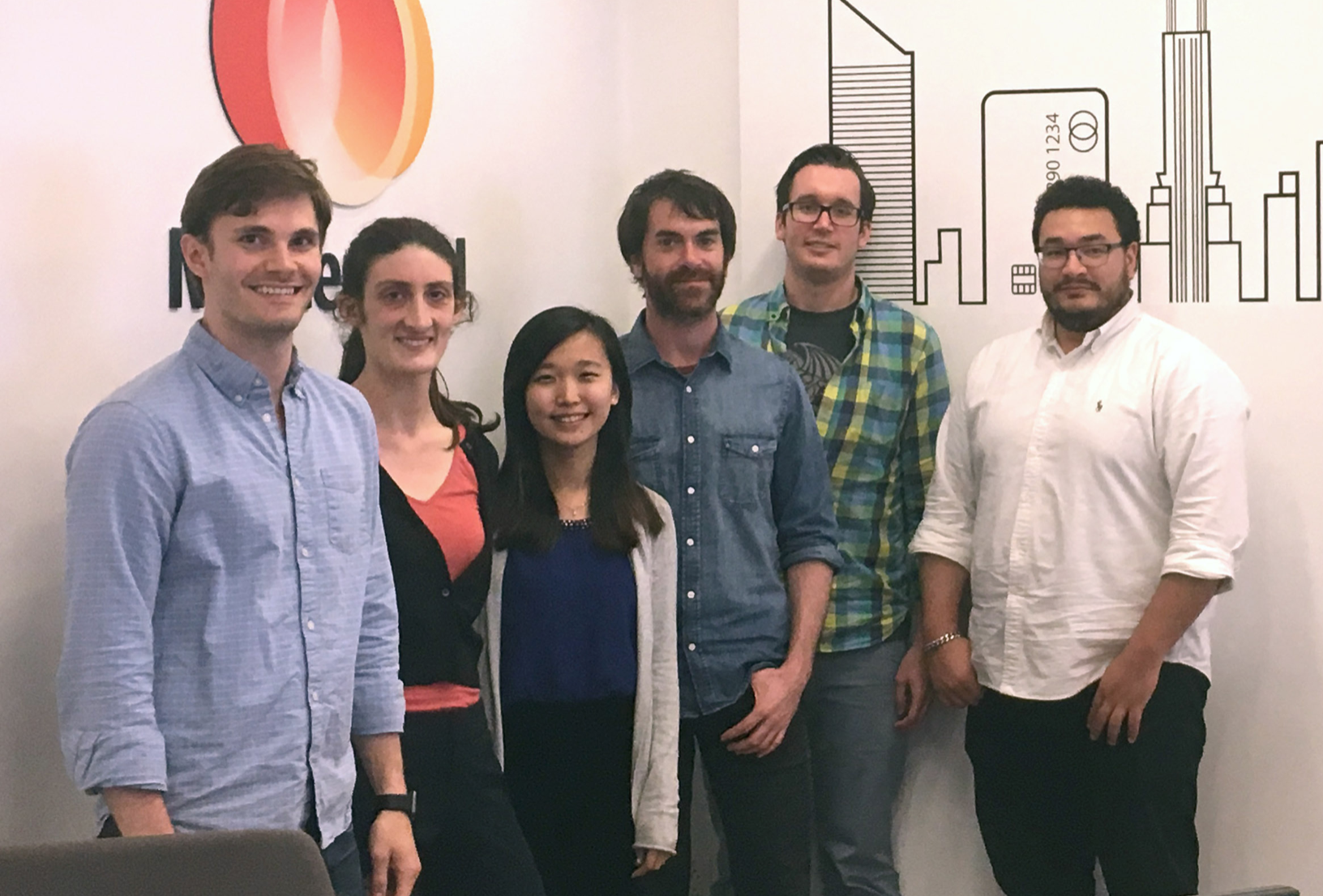
On our two-day visit to Mastercard's New York City office, we spent time presenting these prototypes and ideating pivots that would make our concepts stronger. On the last day, we created a preliminary service blueprint for what would later become Local.

Design Strategies


As our needs changed throughout the design process, we adapted our process and tools. We moved from hand-drawn sketches in journals and on whiteboards to Sketch for static digital screens, to Marvel for click-through prototypes, and finally to Principle for micro-interactions and animations. We also created a visual language to ensure cohesion across touchpoints.


User Testing


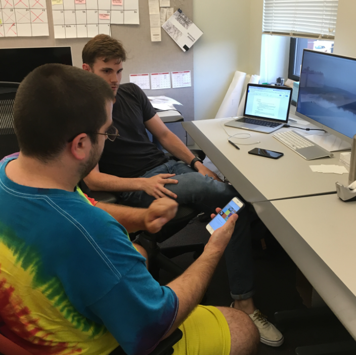
Throughout our design process, we’ve been constantly testing our ideas with users. We started with speed dating storyboards and later conducted mid-fi and hi-fi testing of prototypes both with our peers and with users we recruited around Pittsburgh. We made sure to speak with both consumers and merchants to ensure we were meeting the needs of all of our stakeholders.