FutureFinder helps students explore their own interests and potential careers broadly, in quick and motivating sessions of about 10 minutes a day. In our design process, we had several key design decisions and principles to accomplish this based on our previous opportunity insights: providing Diverse Career Exposure, in a Quick and Easy way that is Motivating and Regionally and Demand-Relevant.
Diverse Career Exposure
A central goal of FutureFinder is to expose kids to a diverse array careers, even ones the student might not expect. It does so through its digestible 5-card output and matching algorithm. This algorithm matches students on various levels of connectedness, decentering what they might expect are their predictible matches. This allows them to expand their career option knowledge beyond personal networks and random variability.

The system outputs 5 jobs based on a variety of matches to interests, de-centering assumptions about what jobs are right for students and expanding beyond their immediate networks. One student said "I’ve never really thought about astronomy as a potential career and I like that it showed up, and not just ‘These are all the math fields’
Quick & Easy to Use
FutureFinder is quick and effortless to start learning about yourself and possible futures, in 10 minutes a day. High schoolers are often incredibly busy and want easy and quick ways to digest content and get value. Students complained that other products like Naviance require too much effort and don’t fit into their busy schedules filled with extracurriculars. FutureFinder breaks learnings across sessions and provides a streamlined daily flow. And it can be done in only 10 minutes a day.
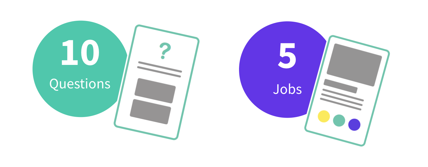
10 Questions and 5 Jobs can be done in under 10 minutes a day.
"It’s not too short that you don’t learn enough, but not too long that it’s too much to take out of your day."
— Tenth-Grade Student
Motivating Retention
Since teens get value from FutureFinder through more interaction, it needs to motivate returning and forming habits. It does this in three ways. Students are timed out of answering more questions and jobs until the next day, which creates shorter but rewarding sessions that students look forward to. The questions themselves are interactive and interesting, with sliding scales and videos. Finally the search for self-discovery motivates students to unlock more insights through answering questions. Overall, it creates a motivating cycle of interaction and expectant discovery for every session.
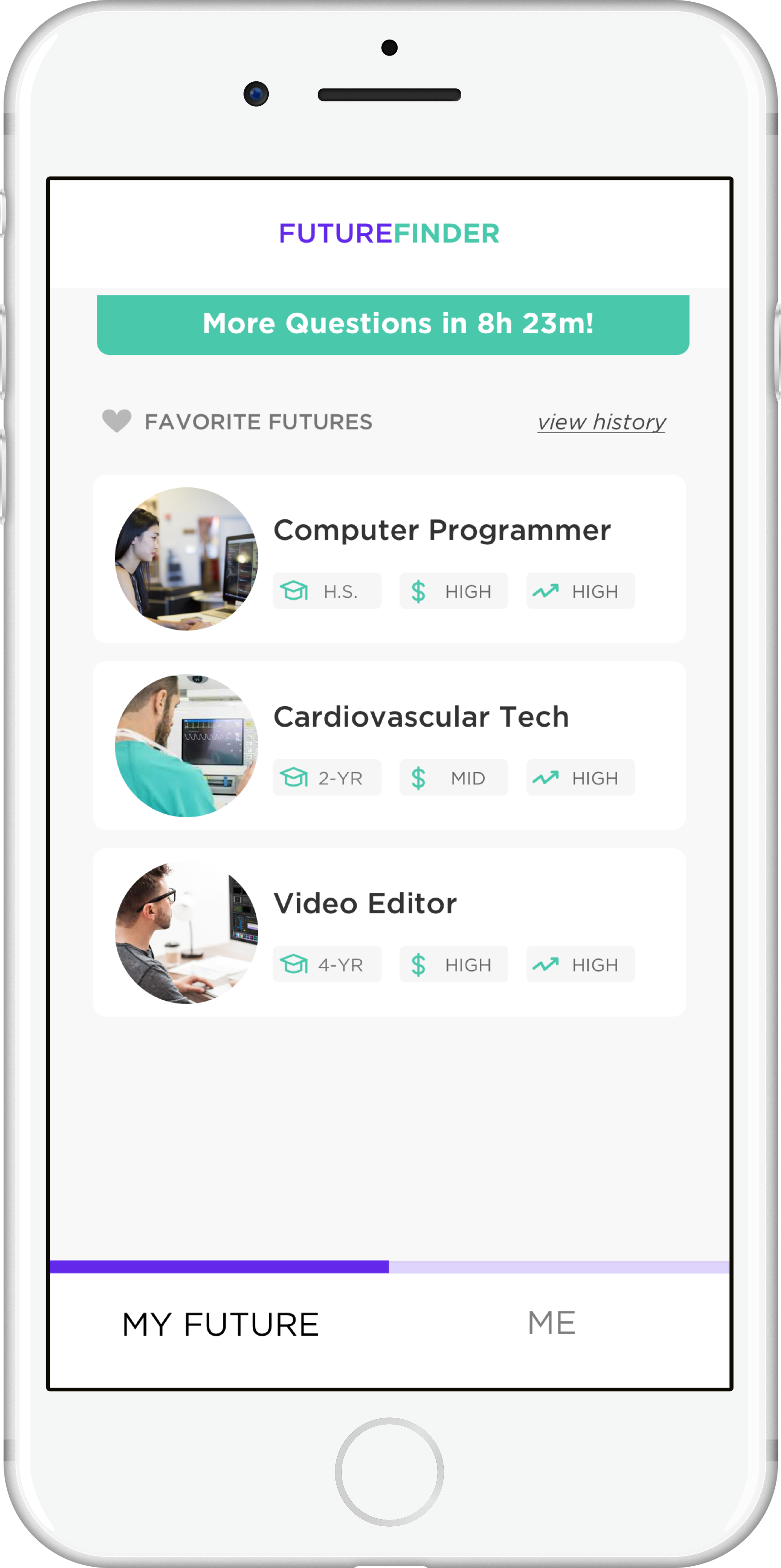
Timing students out creates habit formation, knowing exactly when to come back.
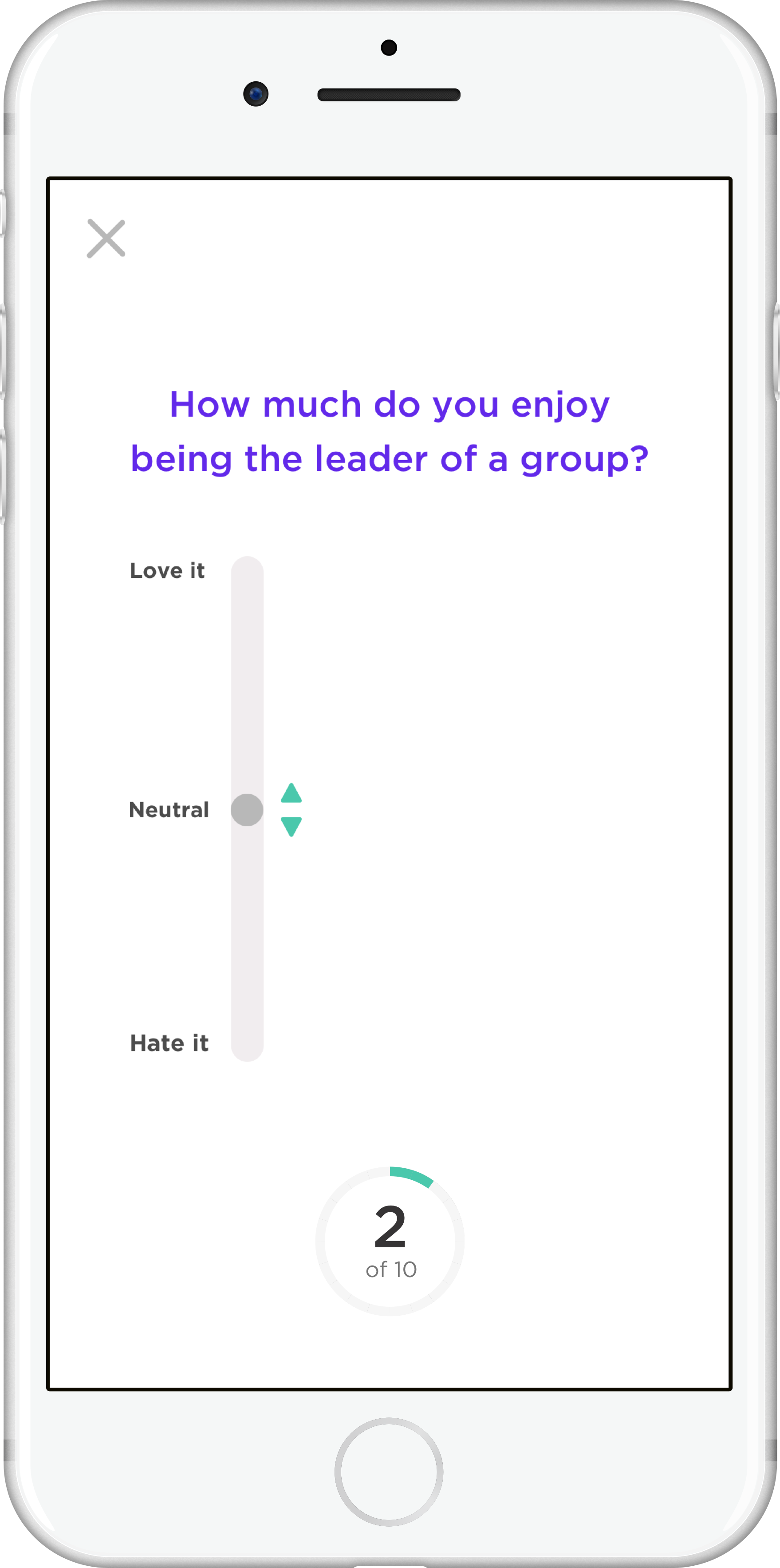
Interactive content makes daily quesitons fun.
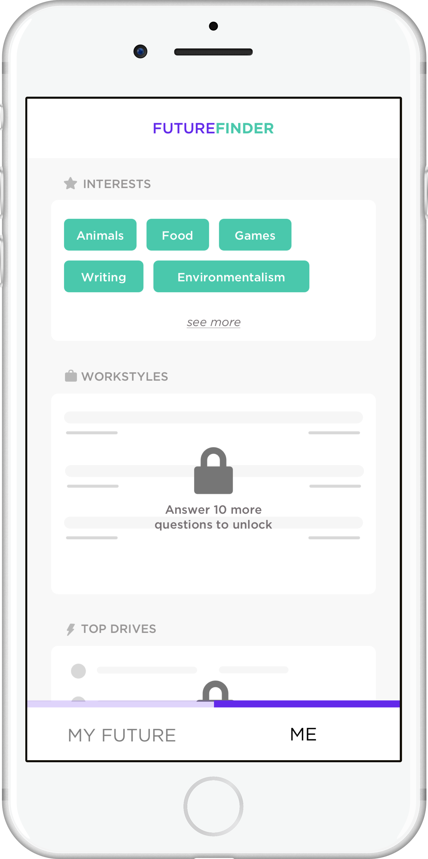
Lock screen encourages more sessions to access self-discovery insights.
Regionally and Demand-Relevant
One of the goals of the Allegheny Conference is to promote high-demand jobs in the Pittsburgh area to promote a healthy and sustainable future workforce. FutureFinder subtly brings high-demand jobs to the equation by integrating regional demand data and realistic career paths into job information. It also ensures 1 out of the 5 jobs a high-demand job, so that users are exposed to up to 20 high-demand careers through the use of the app to get teens thinking about these directions.
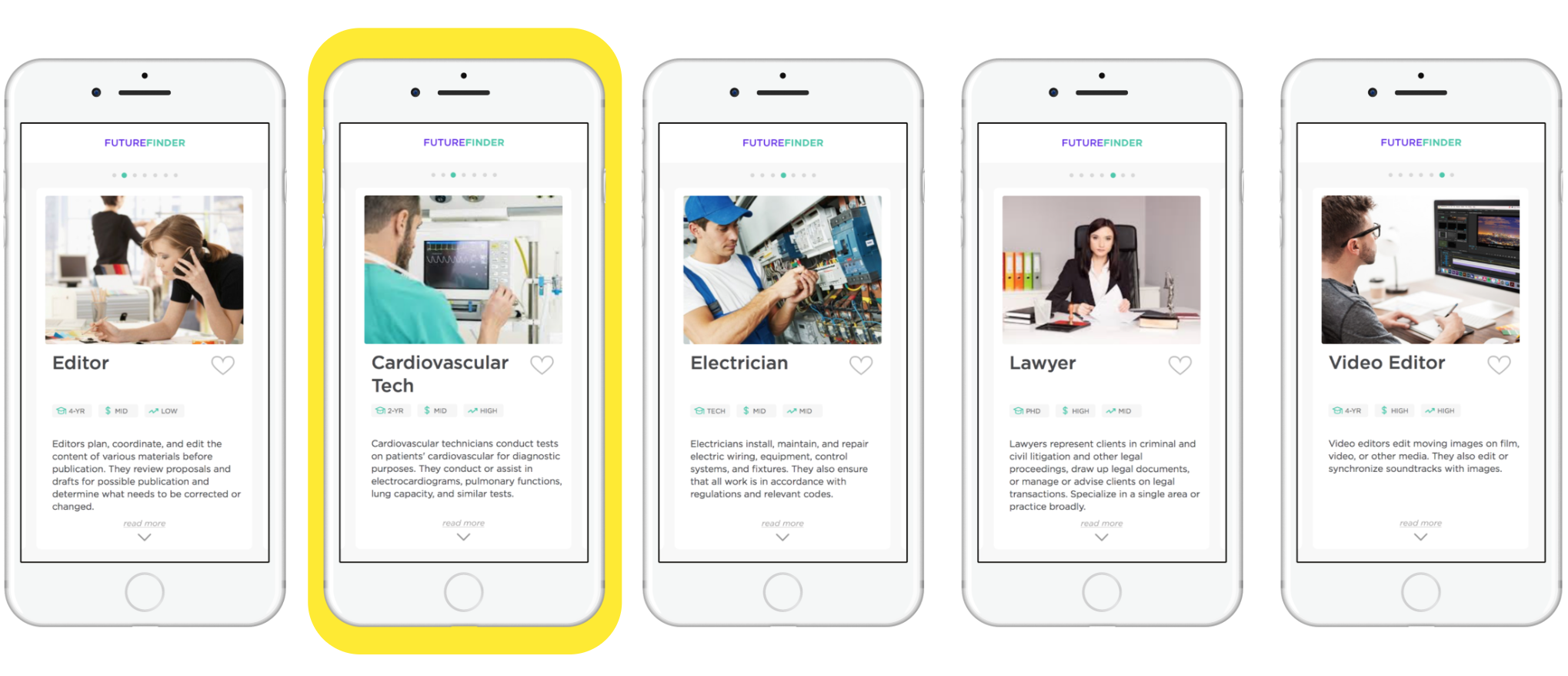
Users get at least one high-demand job in each session, highlighted here in yellow.
Although we tested multiple previous designs before reaching our final concept, we also did two rounds of user testing to shape and validate FutureFinder.
Preliminary User Testing
For the first round of testing FutureFinder, the concept was still in flux and we A/B tested two purposefully different designs to gauge a few hypotheses. We also conducted a card-sorting exercise and A/B/C test of card layouts to help us better design job cards using what mattered to students.
A/B two designs in an Invision click-through, we tested whether students were more interested in self-dicovery framings than career-finding framings. We also tested perceptions of question quantity. We found that students were not actually motivated by disguising career exploration in self-discovery — they saw through didn't want to feel lied to! We also learned that the amount of questions correlated with the trustworthiness of the system's level of knowledge. 10 questions seemed like the right amount to be quick but feel trustworthy.
Card sorting yielded the below groupings of job information by their interest. Growth was interestingly ranked in the lowest group. Students also prefered full click down and scrolls, and really like example career journeys.

Final Prototype Test
FutureFinder was prototyped to a high level of fidelity using Framer.js. For our final test, we wanted high schoolers to fully experience the design, and so we created a full backend in Airtable, over 30 jobs with content, a personality quiz, and a working version of a diverse matching algorithm.
For the final test, we conducted largely unguided think aloud usability tests to measure if students understood the system without help, if they were succesfully completing tasks, and if it was meeting their perceived needs. We did not have bandwidth to make these final design iterations, but we measured our prototype against key metrics of success including use behavior and qualitative responses to the app. We also did a post-interview questionaire to hopefully elicit more candid responses. Feedback on design decisions are above, and further metrics are below.
Students favorited jobs at a very high rate, and favorited high-demand jobs at a rate higher than expected at 41%. There was overall a large amount of positive feedback, with more reports of downloading than any of our previous user tests.
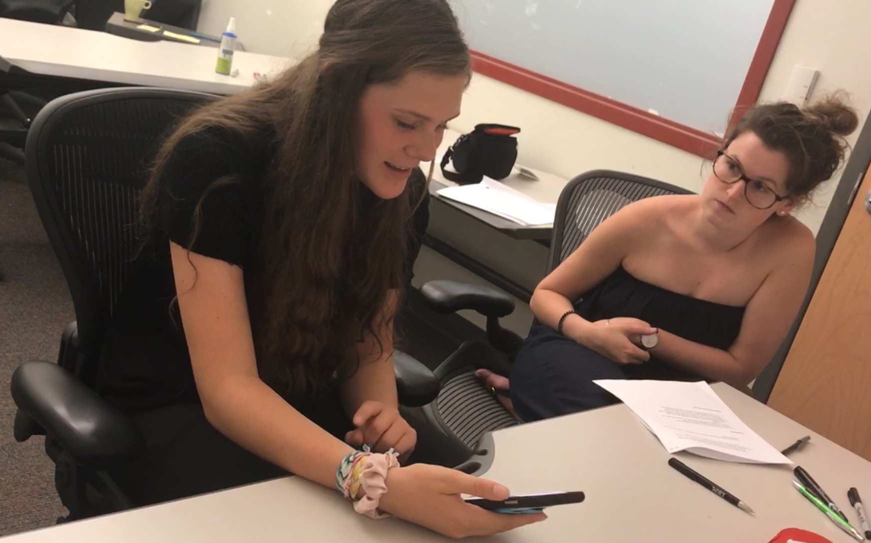
4 out of 5 students unprompted said they would download or use the app
12 out of 30 jobs were favorited

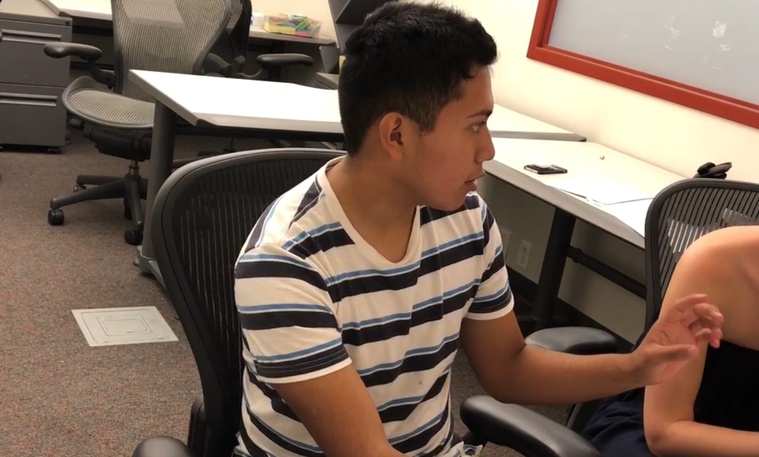
41 % of favorited jobs were in high demand in PA
