Because we wanted our tool to both fit in and help streamline the workflow for content creators, we sought their thoughts and feedback at every stage in the design process. We started with parallel prototyping, sketching out different ways we could address the pain points around collection, contextualization, and synthesis we learned about from interview with 10 content creators.
Then we tested those point solutions with our target user or analogues users to arrive at a proposed workflow highlighting key features that would help them at each step of the process. We conducted cognitive walkthroughs with 4 more content creators, asking them to think-aloud when engaging with our high-fidelity design prototype and eliciting feedback on how this workflow is similar or different from their current processes.
These cognitive walkthrough sessions helped us to validate our intuitions, inform design iterations, and ensure that we were building a tool that fits with their mental model and would actually serve their needs. After several rounds of iterations, we developed the following features in our MVP.
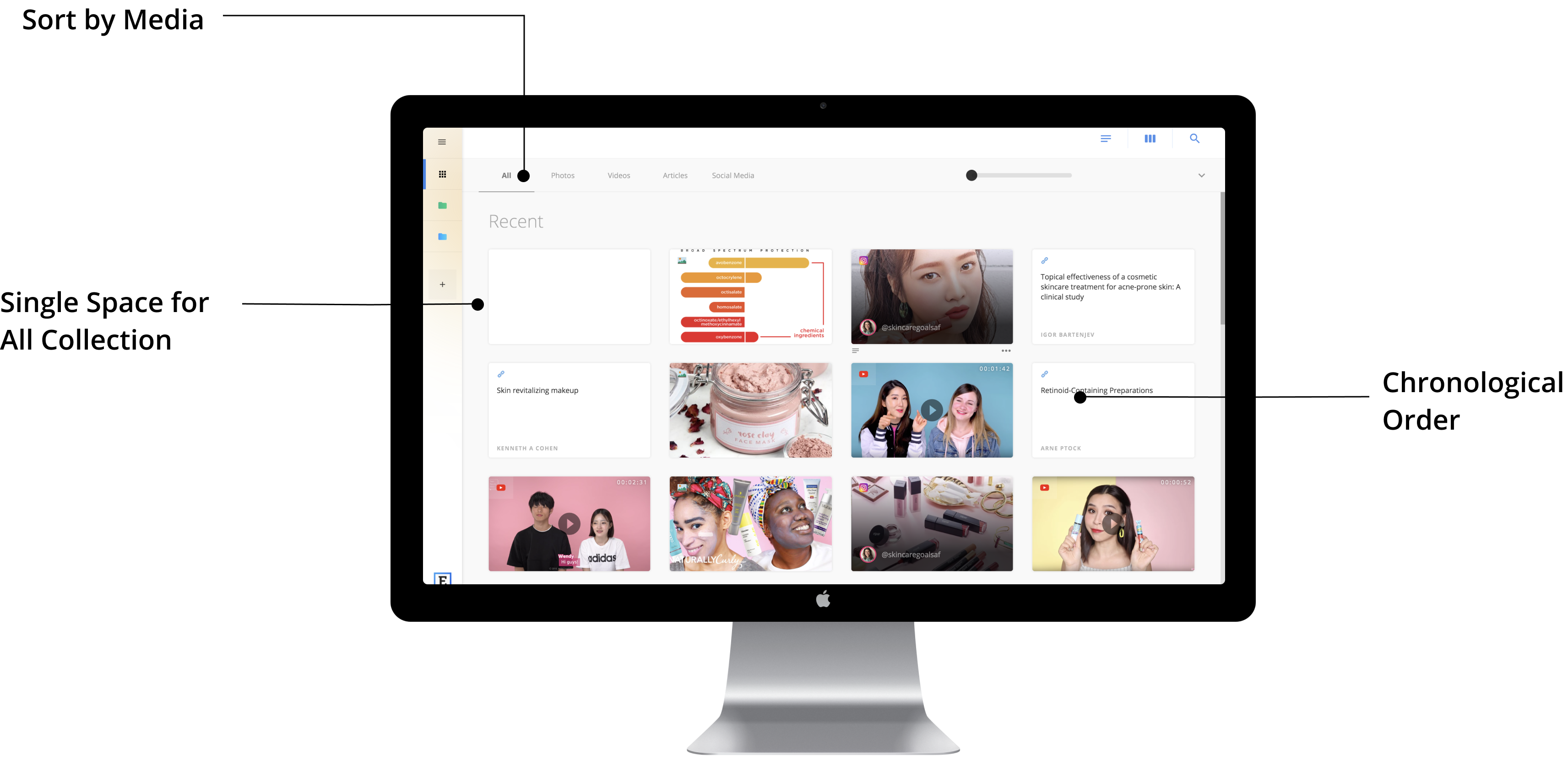
Our first critical feature is a single point of collection. From interviews, we learned that our target users could benefit from highly visual representations of their collected research that show the type of information, original source, and enough text and photos to scan quickly and remember easily.

Users rely on different kinds of metadata to remember the content of the source for different types of media

Each source will be visually represented as a clip, containing necessary information to quickly identify the content
Users are likely to collect sources that belongs to the same topic consecutively

Automatically sort clips by chronological order to allow for better group selection
When retrieving information from a longer time ago, users tend to think about what media type it was collected in

Provide options to filter by media type to help users find previous sources
The key success metrics for the design of clips is if the information provided on each clip is sufficient and appropriate for users to identify its content and intended purpose of use after collecting.
After two iterations, our final design for the clips aligns with the mental model of most content creators we tested with. Namely, all clips have source and media types indicated along with the annotations taken when clipped, and the ability to preview. Additionally, multimedia clips would be visually represented, text-based links would stress the title and user-generated highlights, and social media links would include account handle. The participants also find the clips collection to be more well-organized and easier to navigate than their current tools (e.g. browser tabs and list of links).
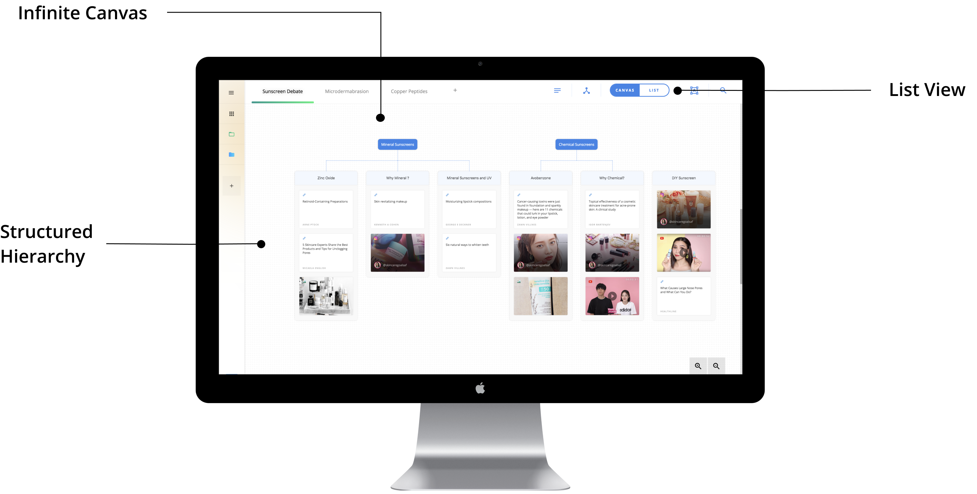
Our second critical feature is the infinite canvas board which supports organization and synthesis at various stages of the sensemaking processes. This is where we allow content creators to begin creating structures and organizing the information they've collected on a given topic.

Users need to see information at different fidelity (e.g. the full content, highlights, just notes) at different points

Allow the user to zoom in and out on an infinite canvas to see the information at varying detail and toggle on annotations
User want to freely move pieces of information when crafting the content

Use drag and drop as the main interaction to maximize user freedom of control
Users want to look at pieces of information together to draw connections

Provide enough levels of hierarchy for the user to separate structure from content
Our key success metric for this features is the number of content creators who can fit their current content within our allowed organizational structure. We started with a single level of grouping and a mindmap-like organizational structure, but found it to be unscalable in supporting a more complicated thought process. After two rounds of iteration, 3 out of the 4 content creators we tested with is able to fit their current content structure into the hierarchy we designed (Topic Board - Header - Groups of Clips). The other content creator simply does not post enough to make organizational structure a critical issue for her.
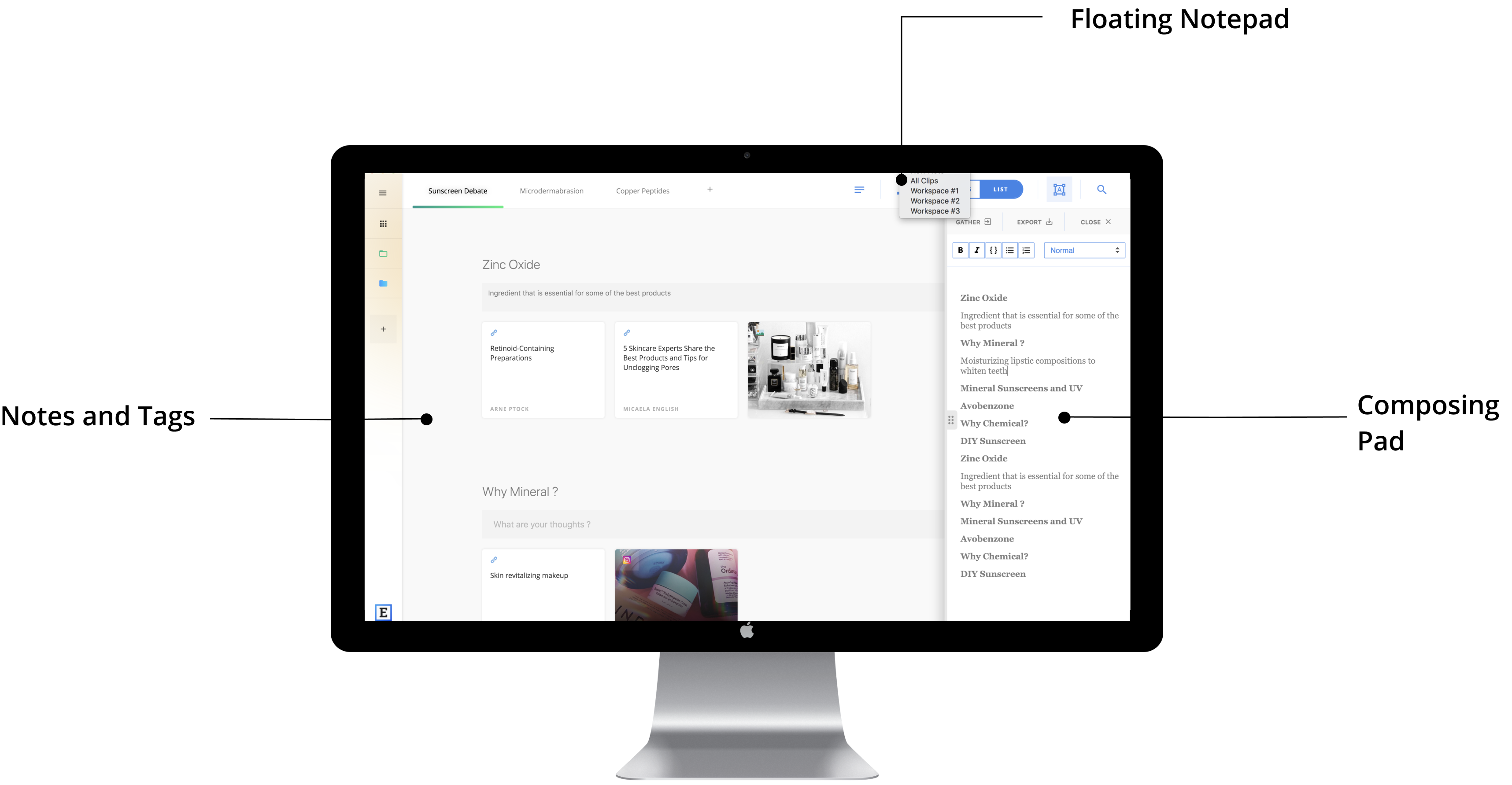
Our third and last critical feature is the ability to capture notes across all touch points of the content creation process. The annotation capacity mimics the current behavior of our target users, with the additional benefit of streamlining all the annotation in one place with a consistent workflow.

Users need to be able to directly take highlights from an article while browsing

Allow notes to be taken/text to be copied onto a floating notepad and synced to workspace
User want to take notes on a source to remind self of the content or intended use

Enable annotations and tags on each clip when collected or to be added later
Users want to build up the content piece by piece in a structured way

Being able to annotate on a group of clips to capture thoughts along the way and pull in those annotations to create an outline with just one click
We know that currently content creators use multiple tools to capture notes and their thoughts. The key success metric for this feature was that we were able to remove at least one tool from the majority of content creators’ processes with our annotation capabilities. We found that in all 4 cases, we were able to remove at least one tool (e.g. Google Docs, Microsoft Notepad, Apple Notes) and help them consolidate the workflow.
Within the timeline of our project, we were able to iteratively design and test our concept, the key workflow, and highlight features to help content creators expedite their sensemaking process. We are glad to know that our design is desirable for the target audience. However, since our tool does not currently have back-end data storage capacity and integration with Fuse to actually clip information, we cannot evaluate the efficacy of it in a more realistic scenario. If we have more time and technical support, we would conduct a longitudinal study with content creators to see if our design is truly useful in their everyday life and can fit perfectly in their processes. We would also deploy usability testing methods, such as think-aloud, to make sure we provide a seamless and highly usable experience,