
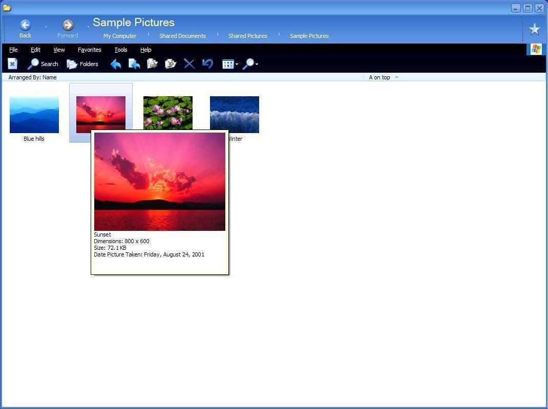
It looks like a new mid-preview here. The thumbnail has a larger preview with more info. I don't know how usefull that info is (meta-data not presented well) but it is nice to be able to do this without opening the file completely. IMHO, this is about the max I would tolerate for previews, but it is definitely usefull)
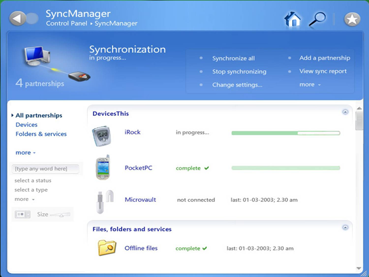
I think this is a great menu style. You can see all the items to select from, where they are in the list (how manu clicks to get there) and an icon to represent each. It is clear which one is selected and specific info is displayed nicely. Notice the return of the nice widgets in the upper right hand. There is also some nice typography going on on the left hand side. The menu item selected is bold and has a pointer. Subtle, minimalist, clear.
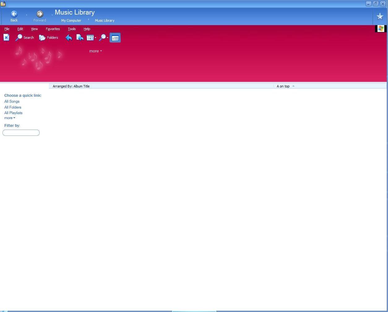
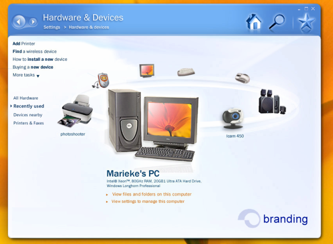
It may be hard to se here, but there looks like there is some animation going on to reinforce that you are in a music folder. The notes may float about. Either way, I think this is a good opportunity to use the graphics card when nothing else is goin on in the file manager. Also, notice the ubiquitous filter textbox - but no search (?)
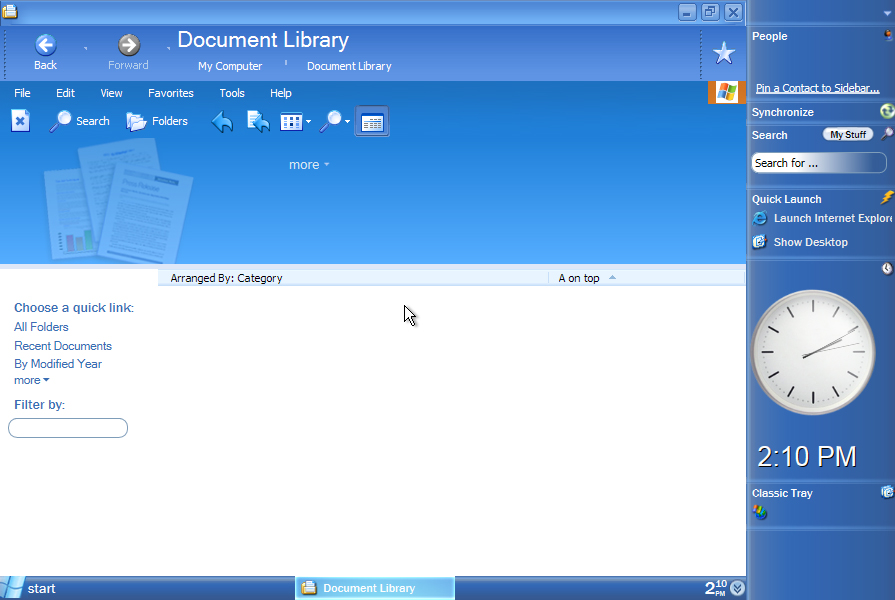
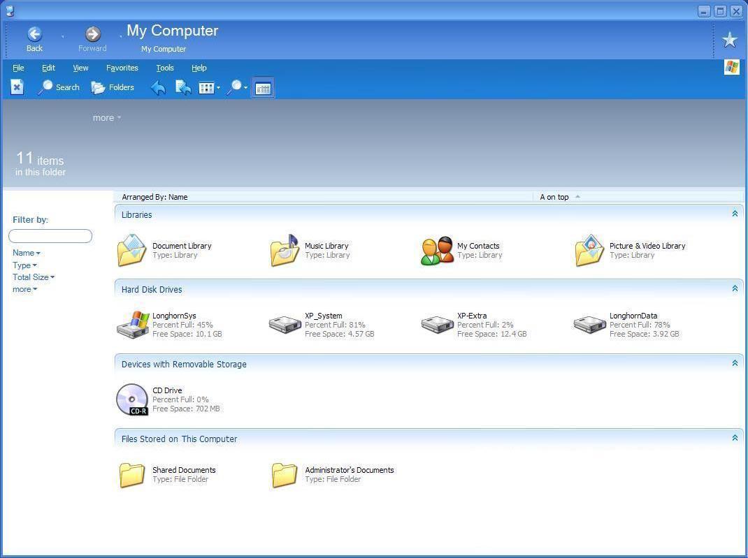
Another view similar to the one above. In this case a folder for documents only. I think the shaded picture/icon in the backround is a nice cue to the folder's contents. It kinda draws the eye though. Where have the nice shaded widgets from teh first screenshot gone?