Design: Prototypes
-
Our design went through many prototype stages before it reached its final design. These are some of the key phases of iteration.
-
first iteration of prototyping: paper prototypes
-
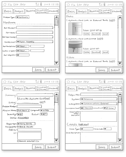
We decided that our first foray into prototyping should be as low fidelity as possible in order to make best use of our time. For this reason, we created a paper prototype. These "sketchy" paper prototypes were useful quick iteration and initial user tests in order to receive more honest criticism from users than more refined prototypes tend to receive.
-
Second Iteration of Prototyping: Testable Handheld
-
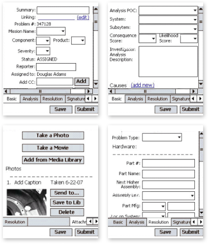
Because our early designs used only the most established and familiar widgets, this early version of the interface could be quickly implemented using the widget libraries of C#, a language supported on the Symbol handheld. With the design of the paper prototype now on a genuine, hardened handheld platform, we could now retrieve very relevant test results, with minimal investment of programming time.
-
third Iteration of Prototyping: Splitting of Prototyping Platform
-
While the design process for the next iteration was underway, a workaround was discovered for speedier iterations. Instead of C#, a high-fidelity language that required a difficult-to-use and frequently inaccurate emulator environment to prototype on, we chose HTML.
Originally, we had believed that only through C# could we access camera functionality on the Symbol device, an important aspect of our design that required user testing and iteration. However, a developer figured out how to reference the camera image of the handheld through use of an HTML metatag. This allowed us to turn the PROPHET interface into a web application using HTML, a low-fidelity prototyping language useful for fast iterations.
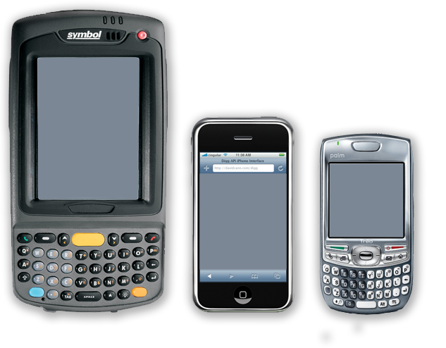
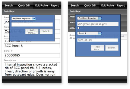
We now had two mutually exclusive user interface needs, the technician requiring use of rich media and the engineer requiring effective search capability, as well as two mutually exclusive devices, a Symbol with camera and bar code reading functionality and an iPhone with advanced JavaScript support. Thus, we chose to continue prototyping the technician's basic interaction, including use of rich media, on the Symbol MC70, and to prototype innovative interactions such as the new Quickmode widget on our desktop browsers, for user testing on an iPhone. This also allowed us to develop interface software that engineers would be able to use on the mobile devices they already used, such as Palm Pilots, laptops, and even cell phones.
-
Fourth Iteration of Prototyping: Modularized Role-Based Interfaces
-
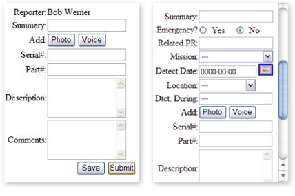
In order to totally modularize the interface across roles, we retained the engineering interface on the iPhone. We then split the Symbol interface, originally meant for the highest-seniority technician in any group of technicians (senior tech, tech lead, and/or Quality, in that order), into two web applications, the Technician and Quality interfaces.
The technician's interface is extremely short and entirely visible on a single screen of the Symbol handheld device. It will extend in length due to the thumbnails of rich media photographs added as a problem report is completed. Although this could result in some minor scrolling during review of the report, it was considered an acceptable tradeoff because technicians are unlikely to record extensively.
The Engineer interface is has many more features and a great deal more complexity than the tech and quality interfaces, because engineers are responsible for using the open problem reports to diagnose problems and to resolve them by creating work authorization documents for technicians to follow.
-
fifth Iteration of Prototyping: rich media
-
For the second and final ORT, we added the capacity for the use of the camera and bar code reader to the Symbol prototype. This required a metatag placed in the website that would reference a server online. Fortunately, the interface would continue to work on any wirelessly-enabled mobile device even without compatible camera or bar code reader.
In addition, a database backend was created that would allow all data entered through the interface to be recorded to an external server. This allowed us to have a technician enter problem information on one form, and have the results of that entry display on the form of the Following some general debugging and a series of rapid and minor interface adjustments, we were ready for our second and final ORT.
