Team Pyxis
Iteration 1: Low-Fidelity Prototype
During the first iteration of our paper prototype, the design was tested in three key areas: concept clarity, coherence, and desirability. Before moving on with our prototype, it was important to ensure that the concept of the application was understandable to the students. It was also important to ensure that the information which we were providing them made sense and fit clearly together under one application. We designed an application that we felt they would enjoy, but testing whether students would like to use the application and finding out what areas of the apps they found interesting or boring definitely impacted our design.
The methods used during this phase included the following: Task- Based Think-Aloud Usability Testing with Probing followed by Product Reaction Words. During the session, we had the students perform a series of tasks to test the functionality of the prototype and whether the students found it easy or hard to use. The first task required students to provide feedback about the overall content on the home screen, including the schedule and real-time panel. We then had students read about an activity, find more information about a specific astronaut and experiment, and look through an image in the image gallery. As the students executed the tasks, they would think aloud and explain their actions while sharing their thoughts and questions about the prototype. At the end of the session, we had them highlight those words from the Product Reaction Words list that helped them best describe their experience using the application.
Findings- Schedule is busy and confusing.
- Navigation is easy, but seems “tucked in the corner.”
- Engagement needs improvement.
- The content seems interesting and inspiring to students.
- Students enjoyed visuals and craved more.
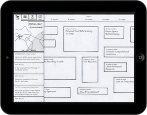
The first iteration of our prototype was sketched quickly, then scanned into an interactive iPad document to simulate a real touch experience.
Iteration 2: Mid-Fidelity Prototype
During the second iteration of our paper prototype, the design was tested in three key areas: concept clarity, desirability, and how well the design supports exploration. We received from faculty mentors and peers on whether students feel comfortable exploring the application while observing where they focus their attention as they navigate from screen to screen. This round of the prototype was created at a mid-fidelity, which means we added more imagery and transitions while maintaining a rough, sketchy look so the students don't get bogged down in the aesthetic appeal of the application itself. We still wanted to test the concept of the application after we made major change to the navigation of the application and the presentation of the timeline data.
The methods used during this phase included the following: Exploratory Think-Aloud Usability Testing with Probing, Comprehension Questions, Product Reaction Words, and a 60-Second Commercial. During the session, we had students explore the application at their leisure. While we ran into some issues due to the limitations of the prototype, we were still learn quite a bit through the testing session. We then had them highlight words from the Product Reaction Words that helped them best describe their experience using the application. At the end of the session, the students were asked to create a 60-second commercial which helped us understand what they took away from their experience with the application.
Findings- Navigation is effortless once they figure it out.
- Quick facts are interesting.
- Schedule is understandable, but students didn't understand the local time vs. station time display.
- The prototyped transitions are considered “cool” and engaging.
- The grid of activities are too confusing.
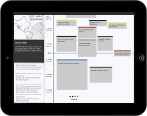
Our second iteration brought major changes in navigation (eliminating the tabs in favor of a more canvas-like approach) and content (with a revamped schedule, quick facts, and a live video feed).
Iteration 3: Mid-Level Prototype
During the third iteration of our paper prototype, the design was mainly tested for comprehension and clarity. We decided to conduct some quick guerrilla user testing to answer some more focused questions which required more testing. Students were provided with an overview of the application goals at the start of the testing.
The methods used during this iteration include the following: Comprehension Questions and Card Sorting. During these sessions, we presented users with screens of our high-fidelity prototype to check their understanding of the timeline. The user was asked questions about the screen they were viewing to check whether they understood what time activities were occurring. We also conducted a card-sorting activity to cut the 12 categories into a smaller list based on what was most understandable for students.
Findings- The folded version of the timeline is not as prominent as the broken timeline.
- The schedule is easy to understand.
- The method of navigation and section names are easy to understand.
- Time zones make sense to science-loving students.
- Students desired depth of content.
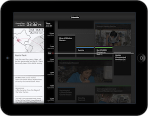
Our third iteration was the first to incorporate a higher level of visual fidelity, and we focused a great deal of our studies on the understandability of a higher-fidelity schedule timeline.
Iteration 4: Mid-Level Prototype
During our Operational Readiness Test (ORT), the application was tested for comprehension and clarity to see whether students understood what they were viewing and how they could navigate through the application. The ORT was used to check whether the application is ready to be released to the public. It was also used to check whether areas that were implemented differently due to technical constraints impacted the usability and desirability of the application. This round of the prototype was created at a high- fidelity, which means that we are simply testing a version of our final prototype. Changes made at this stage in the process would most likely be minimal, unless test results demonstrate that major changes should be made.
The methods used during this iteration include the following: Comprehension Questions and Card Sorting. During these sessions, we presented users with screens of our high-fidelity prototype to check their understanding of the timeline. Like our previous iteration, the user was asked questions about the activities on the schedule and their occurrence. They were also asked about various designs for the longer "Sleep" time block, so in the future, it can be condensed effectively without impacting comprehension. We also conducted a card-sorting activity to cut the 12 categories into a smaller list based on what was most understandable for students.
Findings- Students incorrectly referenced local timezones for activities.
- Students find categories confusing and unclear.
- Learning more about current experiments and activities piques interest.
- Reading current tweets and articles is considered “cool” and valuable to students.
- The translated activity names in this prototype were difficult to understand.
- Interactions were enjoyable.
- Tweets and biographical information are equally interesting.
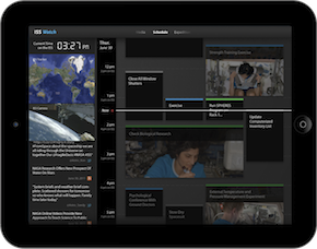
In our fourth round of tests (also known as our “ORT”), we utilized high-fidelity mockups of the entire application and tested navigation between sections, schedule comprehension, the appeal of various types of content, and more.
Iteration 5: Final Prototype
Our final series of tests in the summer tested the application for how well it supported independent exploration and how interesting the application was overall for students. Since our last iteration (ORT) focused exclusively on the functionality of the schedule page, we were interested in seeing how students interacted with the application with the Media and Expedition pages included. Although we had to use our own XML files with content hand-selected from the NASA website for featured experiments and astronaut details on the Expedition page, we designed this file to be easy to maintain by NASA Public Relations and updated for each new expedition. Currently, the images on the Media page are being pulled from the Space Station Research Flickr group. Going forward, we hope the Media page content can simply be pulled from a dedicated NASA ISS database that includes both pictures and videos from the station.
The methods used during this process include: Exploratory Think- Aloud usability testing with probing, Product Reaction Words, and 60-Second Commercial. During these sessions, we allowed users to explore the application at their leisure while observing how they interacted with the application. We occasionally asked them questions to check their comprehension and interest level. We then had them select and discuss three product reaction words that most described their experience with the application to better understand how they felt about the application as whole. We ended the sessions with a 60-Second Commercial to allow students to explain what they liked most about the application and what aspects they thought others would enjoy most.
Findings- The content is valuable and understandable to space-loving students.
- Knowing what astronauts do each day is intriguing.
- Content needs to be improved to provide greater depth.
- The application is accessible and engaging overall.
- The discoverability of some features, like activity details, could be improved.

Our final testing iteration was conducted on the actual working prototype, and we were thrilled to learn that student feedback had shifted from interface problems to a curiosity about the actual educational content.


