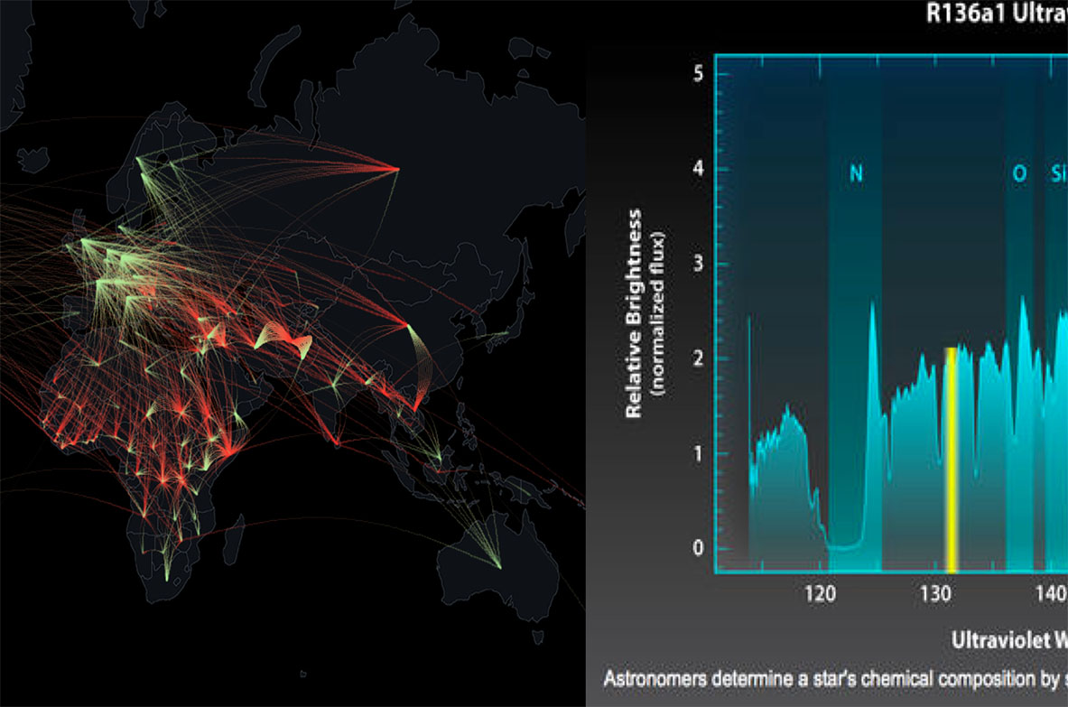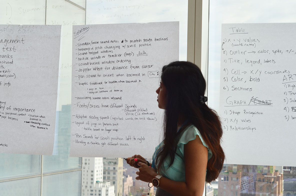
After considering Bloomberg’s interests, prior developments in the accessibility space, and the feasibility of projects given our time span, we chose to focus on the insight, “It’s impossible for me to get the ‘gist’ of the page.” All 5 people with visual impairments we spoke to told us that they struggle with ‘getting the gist' of text, visual elements like images and graphs, and/or keeping track of windows on their system. We brainstormed over 70 possible ideas to solve these problems before deciding to focus on improving the gist of visual elements, specifically graphs and charts. Graphs are essential to the Bloomberg Terminal. They are typically so inaccessible to people with visual impairments that it impedes their pursuit of STEM-related careers, like finance.

While we discussed how we might communicate the smell and taste of the stock market, we ultimately focused on tactile, haptic, and auditory methods. After further research, we chose to pursue an auditory solution so that users wouldn't need to purchase or install additional hardware - they could use their computer or mobile devices.
We conducted a competitive analysis to understand what work has already been done with respect to audio graphs. Our research led us to the Sonification Sandbox at Georgia Tech , which takes in static data and returns customizable audio output of a single line chart. We also discovered the Data Driven DJ , from a developer at the New York Public Library, which explores creative ways to sonify data about New York City. Finally, we reviewed the work of Ed Summers, an industry accessibility expert, whose company creates electronic books with audio graphs of static data on different charts. His technology is the most cutting-edge that we identified in the data sonification space.

Line graphs are commonly found in the Terminal, so we focused on understanding why people find line graphs valuable and how they generally interact with them. We spoke with people with visual impairments about how they first learned to use charts and graphs before researching further.
We conducted graph expert interviews with internal engineers and designers who work on building charts to learn about their design approach and client graph useage. We also interviewed people who regularly use charts on the Terminal to understand what information they look for in line graphs and how they quickly gather that information.
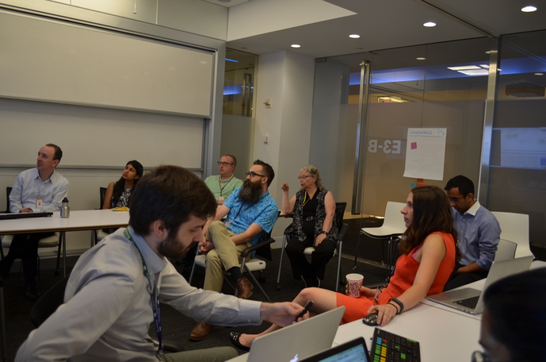
We conducted 2-minute think-aloud sessions with Bloomberg employees in which we asked participants to look at a line graph briefly and explain what information they look for and the actions they perform. We synthesized these results into a keyword heat map to highlight what values are most important for conveying the gist of the graph.
Inital Design Ideas
We presented 11 early ideas as paper and Keynote prototypes to members of the Bloomberg UX team. We also ran our ideas by a Bloomberg employee with a visual impairment to find out which concepts she was most receptive to. From there, we moved forward with ideas relating to helping users with visual impairments get the gist of Graphical User Interfaces (GUIs) or different tpes of data representations. We created prototypes for these 5 specific concepts:
We recruited two engineers from Bloomberg to test our initial 5 design concepts. Each of them completed tasks using the prototypes and spoke aloud about their thoughts.
Although participants had an affinity for tactile charts of static data, we found that designing a new, dynamic tactile interface was not feasible given our time constraints. We therefore chose to focus on data sonification of stock price line graphs.

After some of our earlier testing, we realized that what other projects in the sonification space were missing was an interactive component. Rather than pressing a button to play the audio version of a graph, we sought to create a tool that could allow someone with a visual impairment to piece together a more wholesome understanding of a dataset. SO, we developed and tested 3 prototypes:
Research Questions:
Track-Pad Scrubbing
Keyboard Audio Navigation
Sonification Sound Preference
Recruiting
Because we had limited access to participants with complete visual impairment, we tested with 6 sighted employees as proxy participants. We asked them to interact with the prototypes without any visual interface and answer questions based solely on what they heard.Pilot Test
We first ran a pilot test with our client, after which we finalized our prototypes and protocol, including the post-test questionnaire and the order of tasks.Main Test
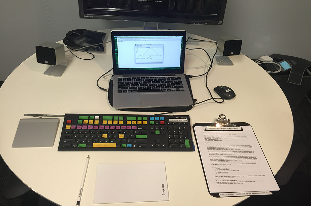
In each session, we conducted a pre-test questionnaire and went through tasks for each the 3 prototypes in a 30 minute time span in the Bloomberg Usability Laboratory. We asked participants to reproduce the audio they heard as a drawing on paper to find out how well the prototypes were accurately conveying information. In each session, we had a moderator and four other researchers observing through a one-way mirror and taking notes.Based on these observations, we decided to combine the positive elements from the two interactive prototypes into a single prototype. We therefore combined the interactive "scrubbing" control for line audio with the key data values from the keyboard shortcuts into a singular prototype.
To address the problem of trackpad disorientation, we chose to switch from using a desktop trackpad to using a touchscreen. The absolute spatial mapping of smartphone and tablet devices would allow users to drag their finger across with the graph without losing their place. We specifically chose iOS over Android because iOS is widely used in the blind community.
Early Prototype
In phase 3, we analyzed our problem space research to prioritize features for this tool:
We brainstormed and assigned a set of gestures to provide the information for each of those features.
We built our prototype using the Swift programming language as an iOS application. A double-tap at the top and bottom of the screen read high and low values, respectively; a double-tap to the left of the screen read the starting value, and to the right of the screen read the current value. A single tap anywhere on the screen read out the price and date of that point on the graph.
We tested our prototype on 1 participant with severe a visual impairment and 3 participants who are blind.
Main test
We asked participants to think-aoud as they explored the graph, used gestures, and completed tasks on both an iPad and an iPhone.
Participants correctly described the general movement of line graphs and identified when values had spiked.
Participants reacted positively to being able to read out specific data points along the graph.
Participants found some gestures confusing. For example, our team had to explain what double tapping at the top and bottom of the screen meant multiple times before participants became comfortable. One participant specifically mentioned a switch from using custom gestures to gestures already used in VoiceOver, Apple's built-in screen reader technology.
We continued to refine our work based on feedback from participants. To see our final prototype, which is a culmination of several rounds of design and testing, please click here.