Evaluative Research

A data silo was clear, but we needed to better understand the social aspects of shopping. Why and how do users socialize when shopping?

Designing the right thing

Over the course of the summer, we focused on refining our omni-channel solution. We spoke with 25+ teenagers and validated the usability of our prototype with HCI specialists.

Conducted

5

Iterative Design Rounds

Tested

25

Target users ages 16-20

Consulted

7

HCI & Design Specialists

OUR DESIGN GOALS

Longevity

We wanted our solution to position AEO for futuristic opportunities over the next 5-10 years.

Intuitive

It was important that our solution was engaging and easy to use for repeated usage.

Persuasive

Helping users translate inspiration to tangible styles requires distancing from abstract decision-making.

Inclusive

We wanted to make our solution inclusive for all body types and gender preferences in line with AEO values
STORYBOARDING AND SPEED DATING

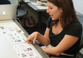
With 35+ concepts, we sought to understand which ideas resonated most with users and why. What was the underlying need?

We tested several socialization-based solutions. Some ideas were more plausible, whereas others sought to elicit a reaction from users. Users' feelings towards our ideas would help us better understand why and how users like to socialize when shopping.
EARLY ITERATIONS

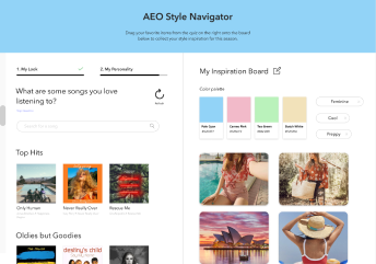
Once we defined the scope of our solution, we set to determine which features provided the greatest value to users.

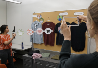
Our early iterations shaped the features that we included in our final product, and helped us fail fast and iterate efficiently. We observed how our solution would impact users' shopping behaviors and focused on making our AR component more natural.
MOVING FROM LO-FI TO HI-FI

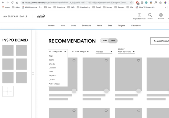
Higher fidelity designs helped us test the interactive elements of our prototype to ensure it was intuitive, natural, and engaging for users.

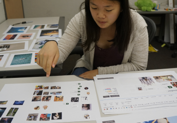
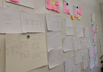
Paper prototypes helped us test overall concepts, rather than polished design details. After deciding the right features to build, we created high-fidelity designs to test usability with our end-to-end, omni-channel solution.
FINAL DESIGN DETAILS

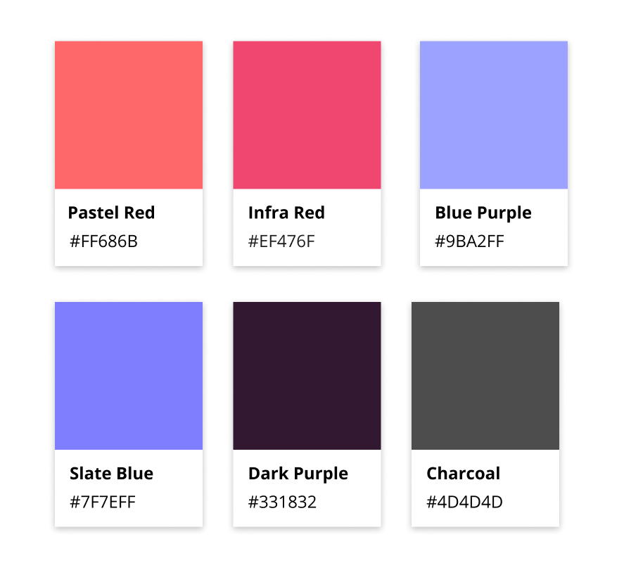
Colors

We used a gender-neutral balance of warm and cool colors to match AEO/Aerie’s aesthetic, while still giving our solution a distinct appearance.

Iconography

Our FindMyStyle icon in particular matches the design of other AEO icons and provides a clear indication of our service.
INSIGHT #1

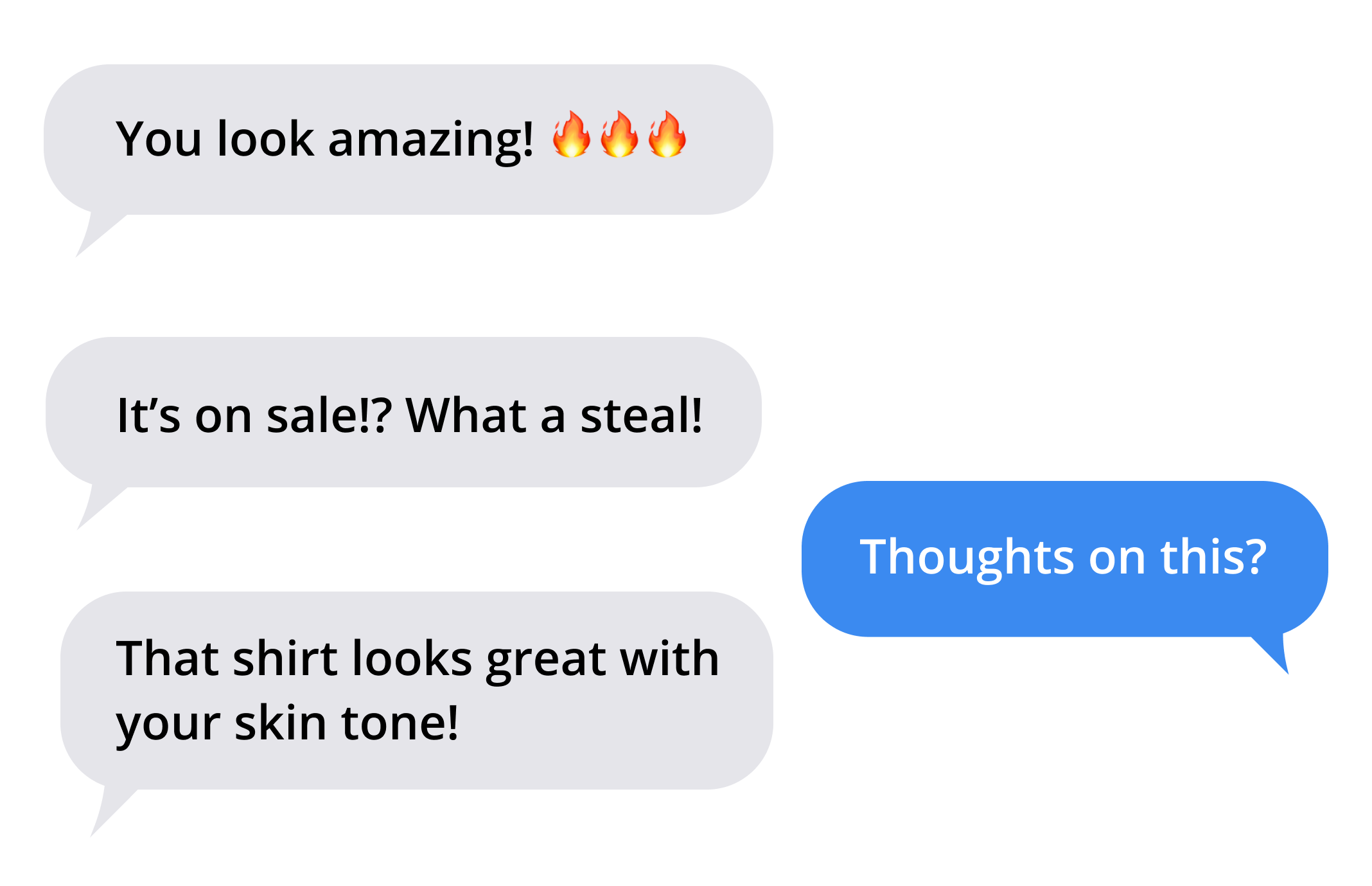
Users have established messaging channels and don’t need additional mediums.

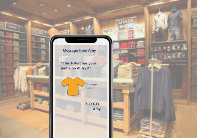
On popular social media platforms such as Instagram or Snapchat, users can message established groups for feedback or publish to a wider audience, removing the need for an additional shopping-specific social channel.
INSIGHT #2

The point of socialization is to receive validation & find the right style.

Ultimately, users care about getting affirmation for their choices, even though they typically know what they want.
PROBLEM REFRAMING

How might we empower teenagers to find the right style at AEO?

Throughout our research we realized that users socialize to receive validation on clothing choices. We decided to help users feel more confident in their style choices. To do this, we needed to give users a way to inject their personality into their style.
INSIGHT #1

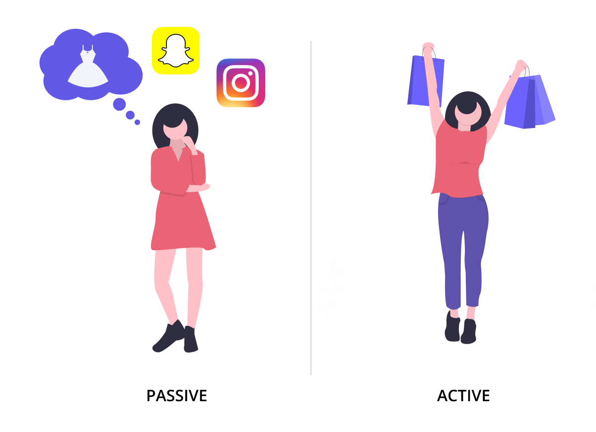
Passive inspiration gathering

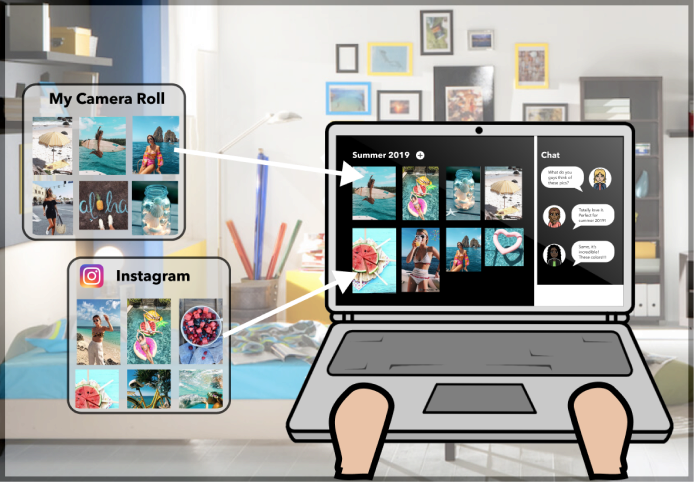
Users are passively accumulating style information to find their ideal style but they don’t know how to translate into actionable purchase decisions.
INSIGHT #2

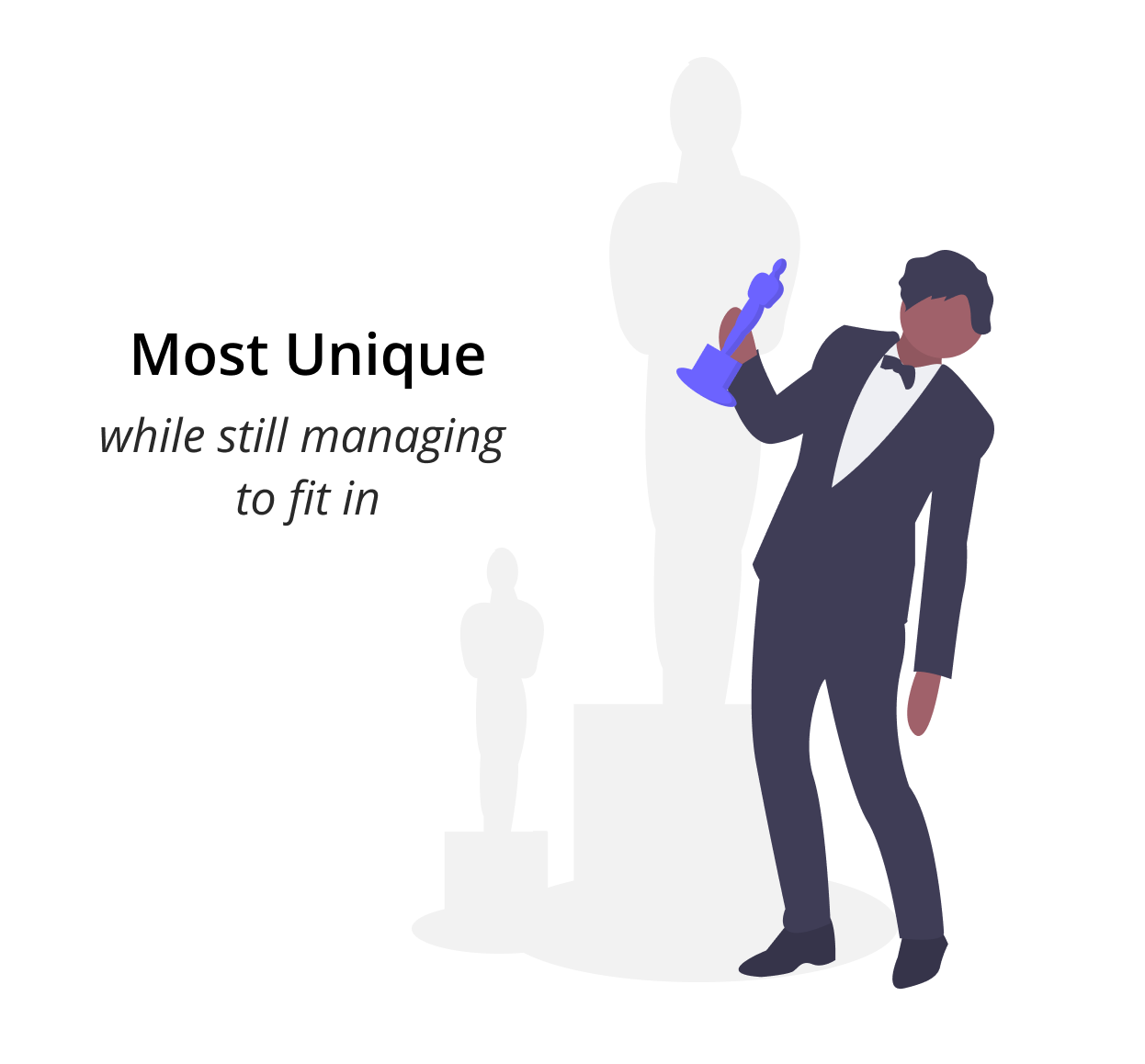
Establishing personal uniqueness

Teenagers are constantly trying to fit-in while still maintaining their own personal style. They want to be the first finders of their unique touches.
INSIGHT #3

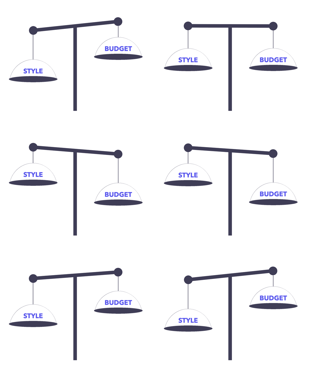
Balancing Style & Budget

Users' priorities change based on the channel. While shopping in-store, users value budgeting and getting the best deal. Online shopping by default facilitates style exploration.

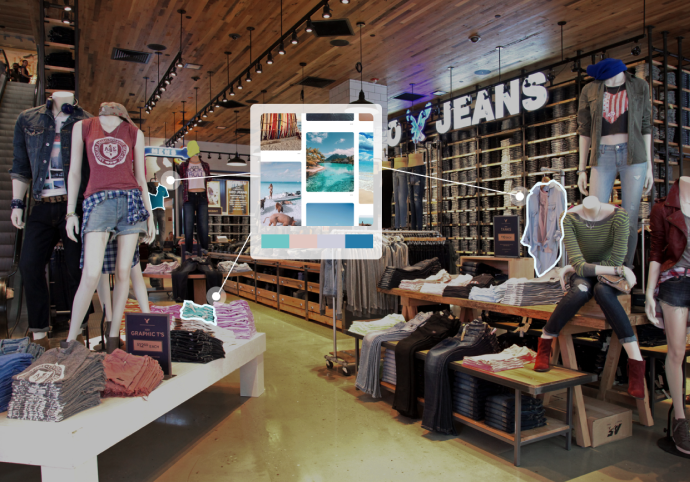
How can these passive activities be leveraged and translated into actionable purchases?

(Through FindMyStyle!)
Our Solution →