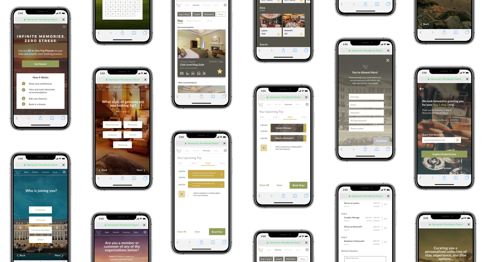
We designed the Trip Planner with the goal of facilitating a streamlined and intuitive getaway planning experience for guests. We made five major iterations with 62 different UI variations, and we conducted extensive user testing with 25 participants. The result was a simple, four-step process that embodies the luxurious Nemacolin brand.
There are four main steps within the Trip Planner experience: Quiz, Results, Itinerary, and Book. Below is an overview of the purpose of each section and the user's experience.
During the Quiz section, the user provides their personal preferences for their getaway. This information is captured in a maximum of 5 questions, minimizing user effort. Importantly, these questions gather the right kinds of information about the guest that the resort needs to create a booking and that the logic system can use to provide recommendations within the Results section.
The Results section is split into three parts: stay, experience, and dine. The user navigates through each part and explores their curated recommendations provided by the logic. The user may tap a card to see more details about an option and indicate their interest by starring the option. After the user has starred at least one stay, experience, and dining option, the Trip Planner prompts them to move on to the Itinerary.
The Itinerary section encapsulates all actions related to the user’s trip planning. Based on what the user starred in the Results section, the Trip Planner auto-populates a lightweight itinerary for each day of the user’s stay at Nemacolin. It selects one activity option and one dining option for each day, thus providing just enough of a plan to get the user started with scheduling out their day.
From this point, the user may edit their itinerary by deleting or adding options from their Interests list. The user may also opt to ‘Clear All’ and build their itinerary themselves. If the user wants to save their itinerary, the Trip Planner prompts them to create an account through which they can access their recommendations and itinerary on their own schedule.
The Book section allows the user to review their itinerary and do a last round of editing before officially reserving their stay at the resort. The Trip Planner then gathers their personal contact information and payment details.
Lastly, the user arrives at a confirmation page with their reservation number and an option to save their screen to their mobile device for easy access. At this point, the user can also email their itinerary and confirmation to other people in their party, or opt to continue browsing experiences at Nemacolin.
We had two main goals when designing the Trip Planner’s look and feel. The first was to align with Nemacolin’s current branding, and the second was to make the resort seem even more luxurious, modern, and posh. We used a minimalist palette based on Nemacolin’s current website, applying few accent colors to inspire a simple elegance and draw the guest's attention.
The Trip Planner is an extension of the Nemacolin website. The site map gives an overview of where the Trip Planner might exist within the resort’s current online infrastructure. It also provides an overview of the various screens within the prototype and how they relate to one another.
The user experience of the Trip Planner embodies Nemacolin’s five-star guest service. The simple elegance is powered by extensive logic in the backend that curates the questions and the recommendations that the guest sees. Together, the Trip Planner and the logic system enable the centralization of crucial guest data and transform the resort’s current approach to operations, marketing, and personalized service.