


Wireframes
Purpose
Our early wireframes were created as a way of beginning design at a more detailed level. The wireframes consisted of three main concepts detailed below, which we presented and solicited feedback on during a class critique.
Desktop widget
We designed a desktop widget as a way of providing a convenient entry point to the system. Since the users main intent is to search for people in the company with particular expertise, the widget enables them to access the system regardless of the work they are currently doing on the computer. However, as a knowledgeable person, the users main intent is to inform others of their availability and communication preferences, so these can also be set in the widget. A status can be set along with an accompanying message to reflect the users current availability; also, modes of communication can be ranked according to preference or even disabled entirely. Since our background research revealed that people often forget to set their statuses on related applications such as IM clients, the system tray icon would reflect the users current status so that they are aware of the status they are currently broadcasting. There is also a bookmarks pane that allows the user to quickly revisit a previous set of search results, or a specific persons profile.
Results page
When the user has entered their search term through the widget, a browser opens and they are taken to the results page of the system. We designed the system to be browser-accessible, as it allows employees access to the system regardless of their location. It also makes it possible for the system to be accessed on mobile devices, which millennial workers are very likely to have.
The results page is where the user sees information about all the possible people they can contact in the company who have some knowledge about their particular search term. The users intention at this stage is to make a decision on who to contact, and so the system presents them with plenty of information in order to assist them in making that decision. Similarly to Google Maps, a list of results appears on the left with a few details about each person, while on the right is a visualization of these results and how the user is connected to these people. The list can be sorted by one of four options: 1) level of expertise, 2) degrees of separation, 3) availability, and 4) physical distance. In the visualization, people are shown as circles connected to either other circles (other people that they know) or rectangles (knowledge topics related to the search term, including the search term itself). Each person node is colored depending on their availability (busy vs. idle vs. free) and is sized according to their level of expertise on the search term. Stroke weight also denotes the frequency of communication between two people, or the frequency of communication that a knowledgeable person makes regarding the topic. Should the user not completely know the exact terms they are searching for, the map displays related topics and whether the currently displayed results are also connected to them. A list of related keywords is also shown at the top of the screen along with the number of people who are connected to that knowledge. Should the number of results be too large, the user also has the ability to filter their results at the top right portion of the screen, with criteria including communication preferences and degrees of separation.
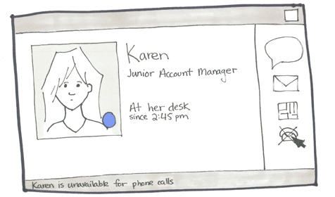
Business cards
When the user has thought about contacting a person from the results page, they can easily access that persons business card by either clicking on their row on the results page or by clicking on their node on the map. The business card allows the user to decide the best way to contact this person, and, based on this information, might even choose someone else entirely if their original choice is not available. The user sees more information about the person, especially their preferred mode of communication as well as any modes of communication that the person has made unavailable. The persons status is also prominently displayed. From here, the user can launch their e-mail client, IM client, IP-based telephone, or see a map of the persons office. Clicking on the persons picture takes the user to that persons profile page with even more detailed information about the persons past projects, work experience, etc.
Early Wireframe Feedback
Although we only presented three screens to a group of our peers, we were able to get valuable feedback that helped us refine our designs. We went into a discussion of whether there was any value in being able to rank modes of communication and decided that forcing the user to rank the communication methods in order of preference was quite a burden to the user. Instead, we decided to simplify the setting of communication preferences and only allowed for either enabling or disabling a communication method. We also went into a discussion about the burden of setting status messages, as well as the notion that employees should always be busy since they are at work. We concluded that it would be less of a burden if the status message was instead always tied to the employees corporate calendar. This way, the system already utilizes information from the calendar but relieves the user the burden of having to set themselves as free vs busy.
The most valuable feedback we received from the critique, however, was that our results page was overly complex, especially the visualization. While we were presenting the user with plenty of information to make an informed decision, we were giving the user information overload since all the information was not needed all at the same time. In particular, comments generally revolved around the idea that we were presenting the user with too many options and leaving too much of the decision-making to the user. Based on this feedback, we drastically simplified the map such that it became an expertise browser (instead of conveying connections between people), removed the ability to sort results and instead changed the design such that the user is presented with the best result up front. Should they wish to explore other results they are able to still browse the expertise details of each result. This feedback was incorporated into our paper prototypes which we used for think-aloud user testing.