Research
In parallel with the early stages of design, we conducted targeted research to help direct our ideas. Since the research phase of the project pointed to the importance of showcasing individual employees and facilitating searching, we examined these aspects of competing sites in greater detail than during our previous competitive analysis.
We also examined the beta site, released at the end of our spring research, in detail. We completed a second heuristic analysis to account for changes made since our first analysis. We performed a study to gather data about the subjective character of the website. We also conducted task-based usability testing on the new beta site to compare it with our prototype.
1. Employee Information on Competitors’ Websites
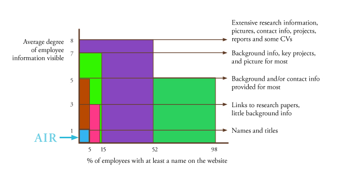
AIR falls short in both breadth and depth
When we examined the employee information available on five significant competitors’ websites in detail, we found no one showed as little information as AIR. Three of these competitors displayed a moderate to high amount of information but only included a small fraction of employees. We recommend that AIR work to publicize the majority of its employees, with a high level of detail about each, which would place it solidly ahead of all competitors.
2. Best Practices for Document Search
Opportunities to modify search for big gains
AIR already implements several best practices in search, such as highlighting recent work and including some advanced search filters. We recommend that AIR enact several other best practices, including offering search suggestions and displaying important fields like publication date in a visually striking, easy-to-skim manner.
3. Updating the Heuristic Analysis
AIR’s newly released site has potential for improvement
The site's search capabilities would benefit from more advanced search filters and a more distinctive visual design for search results. The Reports & Products section should display information such as publication date more consistently and could also afford to vary the look of different types of pages more while keeping the overall consistency. The Expertise section needs tweaks to more accurately guide visitors and may be causing confusion due to inconsistent use of languagetive.
4. Website Character Study
Competent and knowledgeable but not very warm
The website character study revealed that new visitors typically received positive impressions of AIR based on its current website. The site specifically excelled in presenting a competent, knowledgeable image. However, attributes related to humanity, “warmth” in particular, were rated noticeably lower.
5. Task-Based Usability Testing
Site needs to tolerate small errors
Participants in usability testing on AIR’s current beta site frequently struggled to correctly spell search terms and found the site unforgiving of these mistakes. They also encountered difficulty distinguishing between similar search results, as the current site often displays multiple search results almost identically.

A graph comparing the breadth and depth of employee information displayed on several major competitors' websites, with AIR represented in blue.
Click to enlarge.
