Presentation
Presentation, the visual display of content, strongly affects visitors’ overall impressions of the site and the ease with which they can pick out specific information on a page. Presentation covers aesthetics, visual consistency, and information design.
Clear and Inviting Language
Throughout the website, we modified the language to reduce confusion and to increase the site’s overall friendliness and approachability. We replaced the phrase "area of expertise" with "topic" throughout the site, a more common term. For a more inviting feel, we used phrases like "Meet Our People" and "Explore Our Focus Areas."
Visually Tagged Content
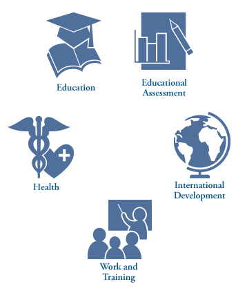
We introduced a graphical "badge" label for each type of content and an icon for each focus area in order to make the site more visually engaging while also adding pertinent information. We color-coded the badges using a limited number of colors—for example, all types of products use the same color—and placed them in search results and content listings so that visitors can rapidly identify the content’s type. The focus area icons are elegant, single-color graphics used on the homepage and in some of the secondary left-hand navigation. The simplicity and subtlety of the icons keeps them from being distracting or gaudy.

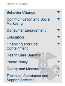
We created an icon for each focus area to add visual interest, shown here as part of a list of sub-areas within Health.
Click to see icons for all focus areas.
