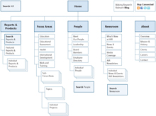
Site Structure
Our final design retains all of the current site’s content but modifies its structure.
Single Global Navigation
Most noticeably in the main navigation, our design uses one main menu instead of two; we collapsed the focus areas into a single menu. This decision resulted from critiques that the current two horizontal menus appeared to imply a non-existent information hierarchy.
"Expertise" Placed Under Focus Areas
We chose to remove the "Expertise" menu altogether. Participants unfamiliar with AIR consistently expressed uncertainty about the relationship between focus areas and areas of expertise. We kept pages for individual areas of expertise but made them accessible only through other relevant pages, such as focus area pages and report pages, instead of via the global navigation. As testing showed that the phrase "area of expertise" caused substantial confusion, we replaced it with "topic," a more common term.
Streamlined Menus
Several other small changes streamlined the menu. We moved "Careers" into the "About" menu, a common pattern, and shortened the "About" menu itself. Previously, the "About" menu had more sub-items than any other main menu item, even though the section contains the least content. We kept all of the content in this section on the site but moved some of its links to the footer and others into the new "People" section.
Integrated Search
Due to the importance of information-seeking tasks, we increased the prominence and efficiency of search throughout the site. Instead of a separate page to search reports and products, we integrated this advanced search into the entire "Reports & Products" section. We used a similar pattern in the "Newsroom" and "People" sections, building advanced search forms tailored to these sections.
Cross-Linked Content
Content is heavily cross-linked within the site. Reports, products, projects, people, focus areas, sub-focus areas, and topics all link to each other. All links to report and product pages send visitors to the "Reports & Products" section. This contrasts with the current site, where a single piece of content such as a report may be accessible via as many as three different URLs, resulting in the same content appearing multiple times in search results. The site retains its breadth and accessibility, with no page more than a few clicks away from the homepage.

Our final site structure.
Click to enlarge.
