Research Preface
To kick off the Capstone project experience, our team began by first seeking to balance our understanding of the autonomous vehicle (AV) space. One concern for us from the start was that some members of the team have worked in some capacity with the car or AV space, such as through an independent study or from full-time positions before the program. We wanted everyone on the team to be as equally educated in the AV space as possible to prevent any unnecessary dependencies moving forward.
We familiarized ourselves about the levels of autonomous driving ranging from 0 to 5, with 0 being non-autonomous, 3 being Uber’s mixed initiative pilots, and 5 being fully autonomous, as well as the challenges of each. This helped ground us to the realism of the AV space in the near future, with better expectations that a “living room on wheels” is not viable anytime soon. Since the idea of complete, level-5 autonomy is not viable for at least five to ten years, our team decided to focus on a sooner reality, settling for level-3 mixed initiative since it offers also a unique opportunity to examine the handoff/takeover opportunities between the driver and the vehicle.
We also read into some of the infrastructural ideas being tossed around, such as the idea of a “Smart Crosswalk” or a “Smart City” and how the AV landscape was hoping to leverage some capabilities of the physical environment surrounding it. After some consideration, however, we later decided that the concept of smart cities would be out of scope for us, since we cannot easily depend on infrastructure and policy to be supportive as of now. Our interest in focusing on a more immediate reality further strengthened our decision to focus on level-3 autonomy.
Secondary Research
The team conducted a great deal of secondary research and literature review during the first 1.5 months of the project. This dive into existing research helped us learn about the autonomous vehicle space, both its current state and speculated future. Our readings delved into a multitude of areas, ranging everywhere from the ethics of AV passenger responsibility, to implementations of augmented reality displays in AVs. However, our most revisited and essential research assets were largely made up of:
- Studies examining the desired user experience of AVs
- Identification and desires of target users of AVs
- Activities of major players in the AV space
User Experience of Autonomous Vehicles
Due to the incomplete and unfinished technological development of AVs, it probably won’t come as a surprise that there has not yet been enough attention given to the user experience of autonomous vehicles. However, we did find a handful of studies outlining some of the largest problem areas at hand.
Trust of the vehicle is one of the most prominent issues facing human interaction with AVs. Suggested solutions to this include providing the driver with some choice over navigation despite the automated GPS system, ensuring that the user can interact with an AV in a straightforward and flexible manner, and having the car clearly express its reliability to the user in a method of communication that they can easily understand.
Many sources have expanded on this last point, citing transparency as an integral tool for increasing user trust. One study looked at what kind of transparency is most advantageous, and found that there’s a delicate balance of providing enough information to put the driver at ease, but not so much that it overloads or leads to overreliance. More specifically, this study found that telling the user why the car is doing something provides this desired information balance, but if focus is instead on telling the user what the car is going to do, this leads to overtrust of the system and poor takeover of the vehicle when necessary. Overreliance is a prominent safety issue in the AV space as it leads to poor supervision and takeover, which are still highly necessary with the current level of AV technology.
The team also came across the concept of strategic distraction during our research. One study by Wendy Ju found that users in an AV who were watching videos on an iPad performed better at takeover tasks than those who were just asked to supervise the AV system. This demonstrated that a way of mediating overreliance on the automated system and disengagement from supervision responsibilities is to engage the user in a certain degree of distraction. This researcher is also noteworthy as she provided the direct inspiration for our Wizard of Oz autonomous car set-up in our primary research phase.
Learnings from current AV systems
We also encountered research on current AV systems and their limitations. One study discussed how users of Tesla Autopilot complain of poor, spotty lane detection, and abrupt braking, acceleration, and deceleration. Another Tesla study found unreliable handling of subtle and complex road conditions. In addition, this paper discussed the importance of a co-driving system, in which the human must monitor the autonomous driving system and be available for takeover during AV failures of environment context.
Another interesting finding was Waymo’s central UX principles for their autonomous driving system. They emphasize four tenants: giving the driver the info they need, helping to anticipate future events, communicating the car’s response to events on the road to the user, and finally, helping passengers safely engage with the vehicle. This demonstrates their consideration of transparency and an intuitive means of communication with the vehicle, which is also reflected in research mentioned previously.
Users of Autonomous Vehicles
Our team also strived to learn about the future target audience for fully-functioning, commercially-available AVs. We found many theories revolving around the concept of a shared autonomy future, meaning that in the next couple decades we can expect wide adoption of autonomous ride-sharing vehicles as an alternative to car ownership. A number of studies described the most likely adopters of this shared autonomy future to be young, urban, educated, tech-savvy, environmentally conscious people who currently do not have a strong desire to own cars due to their environment, and who use ride-share services now. One study also mentioned that those most likely to own autonomous vehicles in the future, instead of opting for the shared autonomy model, are individuals who currently own vehicles and have not tried ride-share services. This research provides some perspective for who our ideal demographics are to test our designs going forward.
We also found a small amount of research on what people might want to do with the newfound free time that comes from AVs, as this is integral to the non-driving aspect of the AV user experience. Unsurprisingly, we found that people want to do what they do already in many other travel contexts - talk to others, text and call friends and family, listen to music, daydream, eat and drink, and browse the internet. This helps inform what facilitation of these activities we should provide, and also how we can leverage these desires in strategic distraction methods.
Major Players in the Autonomous Vehicle Domain
Our team also assembled some shared repositories for information regarding key companies in AV research and development. We focused on some of the efforts of external players, such as Waymo, Tesla, Uber, and more of the traditional car manufacturers below.
Tesla Autopilot
The existing implementation of Tesla autopilot provides an approximately level-2 experience of autonomous driving. There exists a level of takeover and handover where the car is either in autopilot or not in autopilot. While is autopilot, the car is able to control speed (as in relative cruise control, being aware of distance to vehicles ahead) as well as lane positioning and can perform gradual turns and bends. An important note is that the Tesla vehicle, while in autopilot mode, does not observe stop signs or traffic lights: it simply rolls through. This can be concerning to a Tesla user in autopilot mode if they are unfamiliar with the system’s limitations and helps to foster a sense of danger to the user in autopilot mode. Tesla also has controls on the steering wheel for the driver to fine-tune the speed limits as well as tailing distance to the car ahead. Currently, these controls are implemented as knobs.
Uber ATG
Uber is currently piloting its level-3 autonomous vehicles in several major cities in the United States (namely Pittsburgh, Phoenix, and the San Francisco bay area). Uber’s model of shared driving experiences remains, with the customer of the Uber service being simply a passenger in the vehicle while employees of Uber are drivers, engaging in takeover and handover with the vehicle. The vehicle features LIDAR technology atop the car, as well as a tablet interface within the back-seat area of the vehicle to portray vehicular transparency to the customer.
Waymo
Waymo is operating in a similar space to Uber ATG, where they are providing an on-demand ridesharing service to customers involving approximately level-3 autonomous vehicles. Waymo allows for the user to initialize the ride, with a “Start Ride” button. Once the ride has started, Waymo also uses a tablet interface to convey information about the ride to the end user, such as a localized map and estimated time of arrival, but also information about the car itself (including what the car is detecting through its LIDAR, radar, sound, and other sensory technology). Furthermore, the car always affords the user the ability to pull over, with a “pull over” button displayed to the user. The goals for Waymo are to provide a clear interface for a passenger to understand more about the vehicle as well as interface with the vehicle.
From a functional perspective, Waymo and Uber are similar in their goals for the customer in a ridesharing experience. The technology is very similar as well, highlighted by a 2017 lawsuit in which Waymo will receive 0.34 percent of Uber’s equity, valued at $245 million.
Concept Cars
With a history of engineering prowess, the traditional concept car companies also have a fair stake in the realm of autonomous vehicle technology. Note that the concept cars mainly focus on level-4 or 5 autonomy (with the exception of Audi, who is on the cusp of level-3 in production today).
Audi
Audi has declared itself to be at the forefront of autonomous vehicle technology in commercial cars, and for good reason. In 2017, Audi unveiled its luxury A8 Sedan which features an “AI traffic jam pilot” in which the car can handle acceleration, braking, steering, and more under 37mph, so long as there is a physical barrier between the two sides of the highway. The key is that it would not require any driver attention in those moments. Audi has also claimed to have been partnering with Nvidia to sell level 4 AVs by 2020, however whether or not they are still on target remains to be seen.
BMW/Rolls Royce/Renault
Luxury carmaker BMW is also looking to expand into the AV landscape, with an unveiling of a “living room on wheels” designed for the future of autonomous vehicles (level-5, full autonomy). The car itself does not feature a steering wheel or any traditional controls. Instead, it has a large television for entertainment, since attention would not be needed on the road. Rolls Royce is also approaching the full autonomous space as a living room on wheels. While neither has implemented above level-3 autonomy, BMW has some standard aspects of autonomous driving in its vehicles today (such as adaptive cruise control), but remains in research of level-5 autonomy.
Questions
After completing secondary research and exploring exactly what is being accomplished in the field of autonomous vehicles, our team then sought to enumerate our personal questions surrounding the autonomous vehicle space in order to figure out both what we were interested in as a team, and any hierarchical structure that could arise. We performed a post-it note activity, where each member of the team wrote individual questions they had on post-it notes and then grouped alike questions on the board, leading to higher buckets to classify such information.
We originally had over eighty questions which we decided to narrow down based on several limiting factors, such as:
- Was this question (or grouping of questions) feasible with our technical abilities?
- Does this question (or grouping of questions) offshoot into political or ethical issues larger than what we feel we can accomplish in a few months?
- Is this question (or grouping of question) more focused on infotainment than the actual AV aspects of the car?
Questions (By Topic)
How do people wish to personalize their experience in an autonomous vehicle? Is there some means by which an autonomous car can continue to reflect the people inside even if these people are not directly in control of the car at all times?
Questions:
- Is there any consistency between what people want inside and outside of the vehicle? Is everyone different?
- To what extent is it a customizable ecosystem for each user?
- Should we design for customization of the experience, or standardization?
- In shared vehicles, should people have custom personalization?
Considering the occupant will not be directly driving the vehicle at all times, how should we keep them engaged in the drive, if at all? What aspects of driving can we maintain from the existing driving experience to keep it exciting?
Questions:
- What are alternatives to the steering wheel?
- Can autonomous driving be rewarding?
- What will people miss about driving a car?
- What do people like about driving?
- What makes the current driver/car feel special about themselves (the hybrid subjectivity)?
What kind of personal relationship do people want with an AV? How can we quantify what specific drivers might want to interact with the vehicle?
Questions:
- Do people want talking cars?
- Is there an “uncanny valley” type of problem?
- Why do people name cars?
- Should cars have a voice?
- Do cars have personalities?
- Can cars be social?
- Are cars a reflection of someone’s identity or personality?
- Can a car be your friend?
- Can cars be social facilitators?
- Are AVs reflective of a master/servant relationship or peer/friend?
- What do people expect of AV culture long-term?
Considering a grey line surrounding when a user might need to control the vehicle versus autonomous technology, how can we facilitate a smooth transition experience between a driver and vehicle?
Questions:
- How can we perform handoff safely?
- How might we create an approximate sense of fear in an AV?
- What is the right level of attention?
- How do we define “supervise”?
- How do people feel about having a “hands on wheel” restriction?
- Can I make a driving adjustment without taking over?
How can we improve the degree of trust an occupant has with the vehicle they are in?
Questions:
- When is trust important?
- Does transparency improve trust?
- How can we help someone trust a vehicle?
- How might we calibrate trust?
- How can we build rapport with a vehicle?
What are important elements of the surroundings that we should communicate to the user through the car, and how should this be communicated?
Questions:
- How can we convey the immediate space around a passenger?
- What do people want to know about the outside world?
- How much do passengers care about exterior vs interior actions?
How do users wish to control an autonomous vehicle? What aspects of the drive would they like to tweak to have the car perform to their liking while in autopilot?
Questions:
- When do people want to control a car during a drive? Why?
- How can a complex UI control complex driving tasks?
- Will people want to override an AV?
- What controls do people want in a mixed-initiative AV?
- What do people want to adjust in an AV?
Organizing and prioritizing these questions helped us create a primary research plan going forward.
Research Plan
Upon enumerating our list of motivating questions, our team set out to construct a research plan to dictate our efforts moving forward. We looked to combine our known research methods with our questions in a means that would best help narrow down what we would focus on. We also sought to prioritize questions that seemed more fundamental to a mixed-initiative vehicle experience.
| Priority (1 being highest) | Research Goals | Research Topic | Research Question | Research Method | Target Participants |
|---|---|---|---|---|---|
| 1 | essential features/desired experience | Passive Control | What types of things do you want to control | simulation think-aloud/post | anybody |
| 1 | essential features/desired experience | Passive Control | What types of things do you want to control | Existing advanced autopilot interviews | Tesla owners, people who have assisted driving in their vehicles |
| 1 | areas of opportunity | Enjoyment | What do people like and dislike about driving/automated driving? | Interview Extreme User Group | enthusiasts; resistant parties |
| 1 | areas of opportunity | Enjoyment | What do people like about automated driving? | Expert interview - sales people, Harman stakeholders | Tesla drivers; car salesmen, Harman |
| 1 | desired experience | Enjoyment | What do people like about manual driving? | Expert interview - sales people | Car salesmen, anybody |
| 1 | areas of opportunity | Trust | How can we make people trust an autonomous vehicle in different situations? In what situations is a solution needed? | Co-design | MHCI/anybody |
| 2 | desired experience | Takeover | What are optimal steps for a smooth transition? | Co-Secondary research (Lit review VR) | |
| 2 | desired experience | Takeover | What are optimal steps for a smooth transition? | Co-Secondary research (Lit review Autopilot) | |
| 2 | required features | Takeover | When do you want to take over control? | Post-simulation interview | |
| 2 | desired experience | Preferences | What preferences of the in car experience change from person to person while being driven? | Post-simulation interview | anybody |
| 2 | essential features/desired experience | Surroundings | How do I want my surroundings represented to me and why? | Co-design; post-simulation interview | anybody |
| 3 | desired experience | Personification | What kind of personified relationship is desired? | Storyboarding | anybody |
| 3 | desired experience | Personification | What kind of personified relationship is desired? | body storming | anybody |
Considering our research method choices, we decided to broadened the range of techniques used to explore the domain in order to attack the AV space from as many angles as possible. We cared about first trying to learn all we could about the domain from experts or those involved with AVs right now (such as owners of Tesla vehicles with autopilot or car salespeople). We also recognized the importance of constructing our own simulations to help us better elicit user emotions. This immediately resulted in our Wizard of Oz study (WoZ).
Wizard of Oz (WoZ)
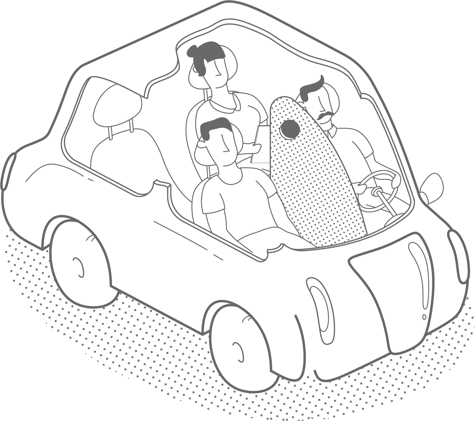
In order to explore issues of the user’s sense of trust, safety, control, and enjoyment, we created a “Wizard of Oz” (WoZ) experiment simulating the experience of being a passenger in a self-driving car. A real driver, obscured by a foam core divider, operated the vehicle at all times with the participant in the passenger seat. We also had a facilitator in the backseat prompting the participant with questions and taking notes, in addition to cameras recording audio and visual information facing the participant and out the windshield. Participants were given the impression that the driver was there for liability reasons and that the vehicle was operating itself. Despite our simple set-up, majority of participants stated at the end of the study that they thought it was a fully-operating self-driving vehicle.
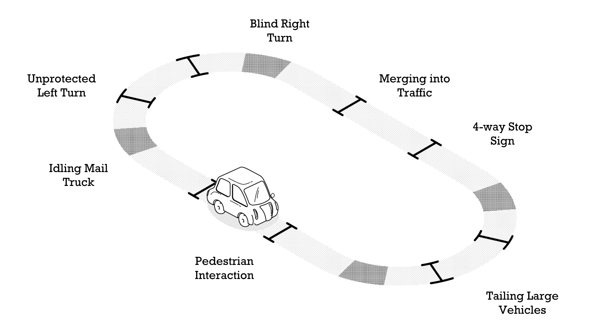
Users were taken on a fixed loop route that included planned critical incidents like stop signs, navigating pedestrian-heavy intersections, and unprotected left turns, plus inevitable unplanned incidents like halted mail trucks and other cars blocking the road while parking.
Participants were instructed to “think aloud” during the entire drive, which is a self-explanatory user research technique used to find problem areas in a system. The facilitator took notes on these comments, and prompted the user after every critical incident to describe what they expected and how they felt about the events that took place. Our team conducted 11 of these WoZ experiments with a quasi-representative sample of participants recruited from Carnegie Mellon University and Craigslist.
Interviews
Tesla Interviews
We conducted phone interviews with eight Tesla owners to understand their experience with Tesla’s Autopilot system, which is the most advanced semi-autonomous driving system currently available. These users represented our best access to the experience of autonomous car users, who don’t currently exist.
Members of our team asked Tesla owners about reasons they like or dislike Tesla Autopilot, what driving situations make them uncomfortable, when they turn it on or off, and if they wish anything about the experience was different.
Car Enthusiast Interviews
We also conducted interviews over the phone and in person with nine self-identified car enthusiasts to learn about what people love about driving, and how we might retain that enjoyment in an autonomous driving system.
They were asked about their experience with cars, what they love about their current vehicles, their thoughts on the future of cars, and what they think about maintaining car culture in an increasingly autonomous future.
Data Analysis
Affinity Diagramming
After gathering all our interviews from Tesla drivers, car enthusiasts, and our WoZ participants, we set on the task of converting all this raw data into insights. To do this, we conducted affinity diagramming, turning 1,100+ data points into a series of hierarchical groupings in order to uncover patterns in user comments. Select different categories below to see overviews of our findings. “I” statements represent the summarized sentiments of multiple users.
- I’m so anxious about losing control that I want to be able to jump in.
- I was constantly double-checking the AV’s behavior.
- I didn’t want to look away from the road in case I missed something that led to an accident.
- I want to feel like I can takeover from autonomous mode at any time.
- I will feel more comfortable when AV’s can reliably predict human behavior.
- There is an implicit culture surrounding human driving, such as hand signals or using horns, that may be tough to capture by an AV.
- The AV needs to recognize human intent to be trustworthy - shapes in the environment aren’t enough.
- Sometimes I or other drivers get uncomfortable when my car is in Autopilot and acts on measurements that are too precise, like a parking space that doesn’t look large enough, or hugging turns too tightly on the highway.
- I don’t think AVs can handle dynamic driving as well as humans.
- I think I can drive the car better than an AV in difficult situations.
- The technology is not developed enough to drive as well as a human.
- There are too many edge cases on the road for the AV to handle them all safely and reliably.
- I’m fearful of tech that I don’t understand or am unfamiliar with.
- I didn’t feel in control of the car when it was an autonomous mode.
- Being driven by an AV was a strange experience.
- I want to know what the car is doing and how it’s making these decisions.
- I feel powerless.
- I become more trustful with AV tech as it performs well.
- I was a little uneasy using Autopilot at first, but I got more comfortable with it after more use.
- The AV did better than I was expecting.
- I’m not sure how the AV knew how to do that, but I’m glad it did.
- I’m fearful of tech that I don’t understand or am unfamiliar with.
- I appreciate how AVs are addressing the tedious parts of driving.
- I wish I could use Autopilot on surface streets, not just highway.
- AVs would be most helpful to me in commute traffic, and for long-distance driving.
- I like that I don’t have to pay attention as much with AVs.
- I love being able to sit back and relax.
- Using Autopilot lowers my stress, and actually increases my ability to monitor safety on the road.
- Some people abuse Autopilot and don’t pay attention as much as they’re supposed to.
- I want my AV to be situationally aware as it makes smart decisions for me.
- I want my tailing distance to be different depending on traffic and other factors.
- I want the AV to be able to flexible in tough driving situations, like gridlock or yellow lights.
- I want the AV to have common sense, and be empathetic towards others.
- My trust with an AV is built in specific moments.
- I began trusting autonomous driving when it braked for me and prevented an accident.
- I became more comfortable with the AV as it continued making cautious and correct driving decisions.
- I trusted the AV more when it was more assertive in certain driving situations because it demonstrated capability.
- I want the AV to learn who I am and tailor itself to me.
- I liked that the AV drove like I would have just now.
- It gets annoying when the AV drives more cautiously than I would.
- I would not have gone there.
- I want to shift the level of cautiousness/aggressiveness in my AV based on the situation.
- I’m okay with the AV’s quick maneuvers when it’s just me, but I want it to drive differently when my family is in the car.
- When the car is in Autopilot, it drives too cautiously.
- I turn off Autopilot when I want to drive more aggressively.
- I make my car represent who I am.
- I think cars should be an extension of someone’s personality, including the way it drives.
- I’m proud of my car and like to show it off.
- My car is an integral part of my lifestyle.
- I need a car for my work commute.
- I enjoy owning a car in the same way others like owning other personal possessions.
- Directly controlling the car brings me joy.
- I equate driving with a sense of freedom.
- I love to let my car loose and see what it can do.
- The increasing prevalence of AVs is going to exclude my interests.
- I don’t think AVs can provide the sense of freedom I get from driving.
- AVs would be good for some people, but not for me.
- I don't have a use for AVs.
- I trust the AV enough to where I feel comfortable using personal tech without hesitation.
- I want to check social media when the AV is driving for me.
- There are lots of ways I would like to interact with entertainment in an AV.
- I want to use the free time I get from AVs to work and check my email.
- I don’t have much hesitation about an AV driving me.
- I generally trust the AV to drive for me, except in extreme situations.
- I use Autopilot whenever possible, and understand its limitations.
- I’m confident that AVs would not be on the road if they couldn’t conduct all the basic driving functions.
- AVs are better than human drivers.
- I feel safer in an AV than with a human driver because humans are not as analytically capable as machines.
- Driving would be safer if everyone on the road was in an AV, driving in a standardized manner.
- I would be more comfortable with AV technology if there were more of them on the road instead of humans.
- I understand the benefit AVs bring to society.
- I assume AVs will be electric and better for the environment, as well as road safety.
- If I don’t have to drive then I can bond more with my friends and family in the car.
Affinity Diagramming
Based on our high-level groupings, our team identified six areas of exploration to take with us into the design phase. These were selected based upon the most supported findings in the data, problems that are currently unaddressed by other solutions, and finally what questions our team was most passionate about answering:
The Moments that Build Trust
Users’ trust in the AV system increases based upon its performance in specific moments during the ride. What are these moments, and how can we facilitate them?
Learning my Driving Preferences and Incorporating Feedback
Users want the AV to drive like they would. How can users convey their driving preferences to the AV during the drive, and how should the vehicle acknowledge and incorporate this feedback?
Establishing Driver Agency
Users need reassurance that they have control over the vehicle, even when it is in autonomous driving mode. How can we communicate that most effectively and make the user feel in control?
Personalized Interior Experiences
Users want the car to recognize their desires and remember their preferences. What specifically do users want or not want the car to do for them?
What to Make Transparent to the Driver
Users need the right amount of transparency into the workings of the AV system. What is necessary to show, what is too much, and how should this information be displayed?
Enjoyable Control of Autonomous Driving
Users derive joy from controlling their vehicles. How can this be retained in an AV system?
Form User Testing
Form Testing | 6 MHCI Students
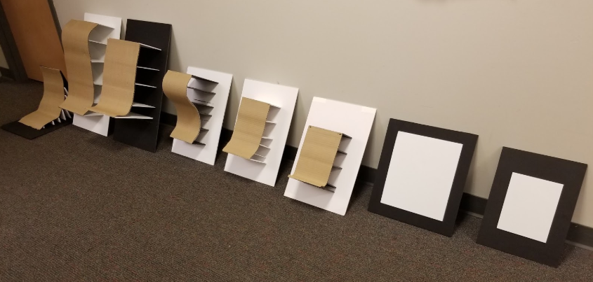
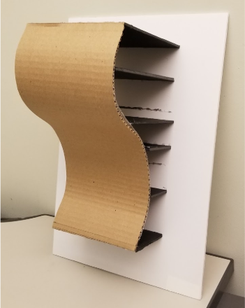
Protocol
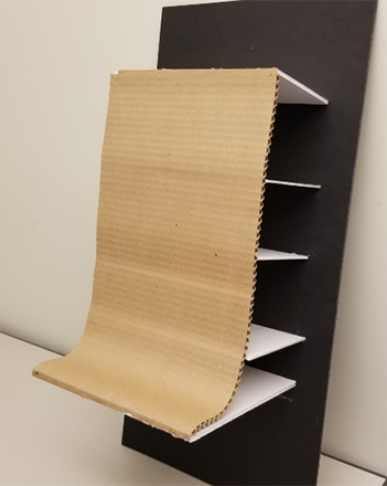
Users were asked to discuss and rank their comfort and confidence using different shapes and sizes of physical controls for the use cases of speed, lane position adjustment, and two types of go/don’t go decisions (right on red and unprotected left). Some were shown a subset emphasizing difference in shape and severity of curve, some were shown a subset emphasizing size, and some were shown all of them. This test and all the following conducted for the remainder of the project was prefaced with an introduction to set the context for the user. This stated that they were in a semi-autonomous vehicle, defined what that meant in terms of car options available and expected user responsibilities, and told them our control was a touch interface for expressing preferences to the car during autonomous driving mode.
Findings
- Users unanimously preferred a smaller size and an S shape, instead of larger sizes and a J or flat shape.
- Majority brought up wanting to minimize movement, preferred a slight curve as opposed to a more dramatic one, and mentioned wanting haptic feedback and applying a car pedal mental model.
Paper Interaction User Testing
Realistic and Abstract Designs | 5 Craigslist Recruits with Driving Experience
Design
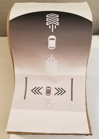
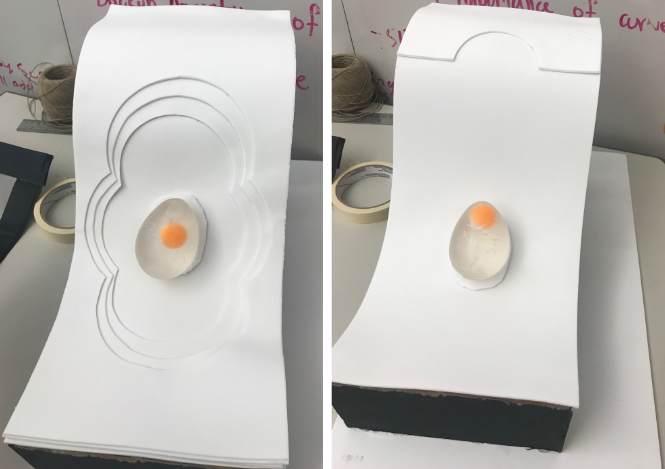
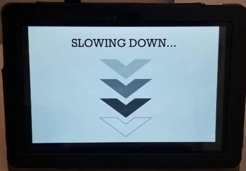
These two designs were created to test if a more literal, realistic representation of the car’s movements was more appropriate for the control, or if people would understand and respond to a more abstract, joystick-like control. In the Realistic design, there’s a distinct area for speed in the upper portion, and an area of lateral in-lane adjustment in the lower area, both of which require a swiping motion along the relevant axis of the control. In the Abstract design, we had a squishable egg and ridges in cardinal directions around it to encourage the user to squish the object left or right for in-lane adjustment, or up and down for speed adjustment. The idea was not there there would be an actual 3D object on the control, but that the digital version would have a shape that reacted in the same manner as the egg when touched. These two designs were accompanied by a secondary screen showing feedback on what action they were performing, and representing that action with icons and minimal labels.
Protocol
Users were asked how they think they can interact with the control (affordances); how they would change their speed, lane position, and make a binary confirmation after being prompted by the secondary screen; and then provide feedback on the interactions that we had in mind. This was done for both the Realistic and Abstract designs with each user. These questions were administered while users sat in front of a driving simulator - see Testing Environment for more details on the simulator set-up. At the end of each session, the user was also asked to rate their hand and arm comfort using the S shape compared to a flat shape.
Findings
- All users thought the binary decision was confirmed by tapping the circle instead of sliding (before we explained our design intentions)
- 4/5 maintained that they preferred to press a button instead of slide for binary (after explanation)
- 4/5 liked the S shape better than the flat shape
- 3/5 thought speed area might be forward and reverse, and were confused about lane change or turning for the lateral area (before explanation)
- 3/5 wanted more information in general about speed and in-lane adjustment
Separated and Consolidated Designs | 9 Craigslist recruits with driving experience
Control Designs


Secondary Screen Designs
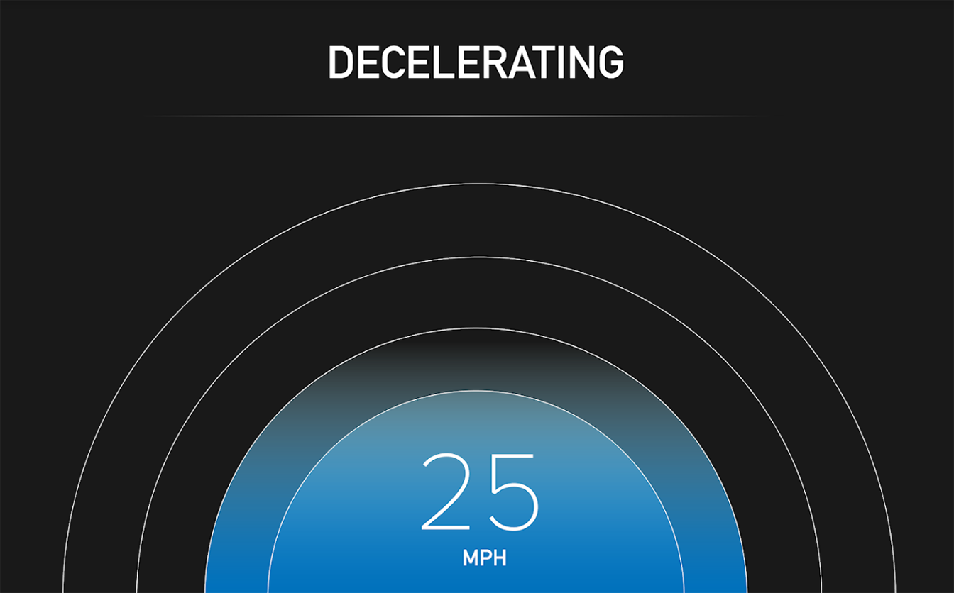
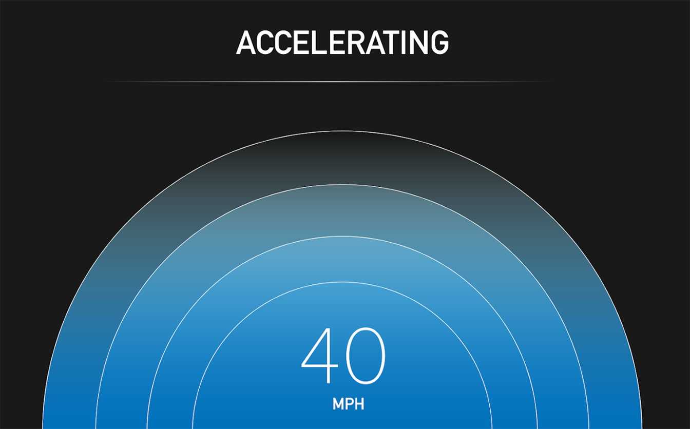
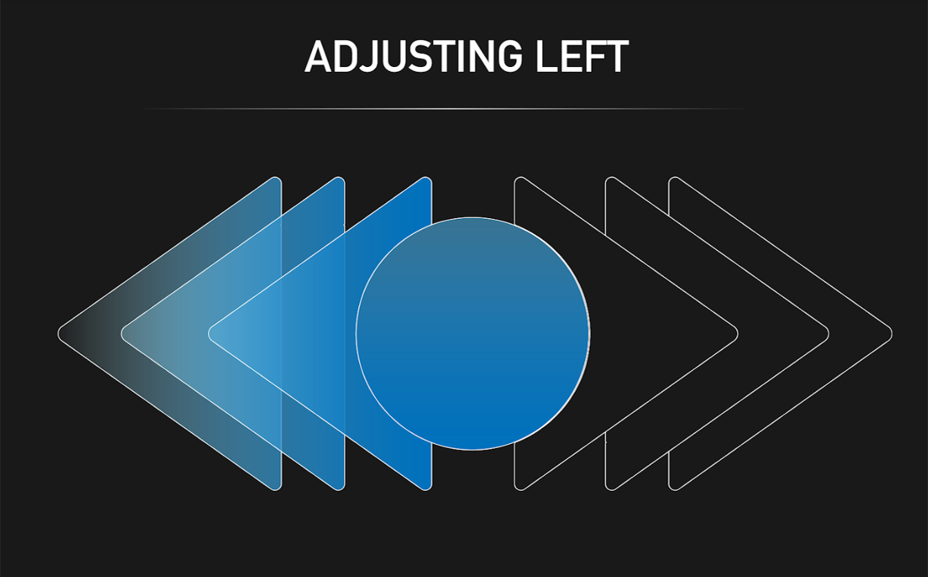
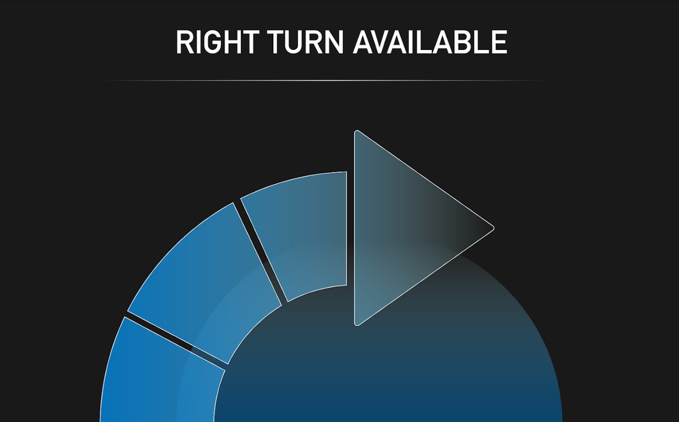
User testing insights that helped inform this design:
- The arrows for speed and lane made people think of reverse instead of slow down, and lane change or turn instead of in-lane adjustment.
- The visuals on the Realistic model made people think they just need to tap to complete actions.
- The physical ridges on the Abstract design were confusing and did not add any value.
Design
In this iteration, we kept the same concepts from the previous Realistic and Abstract tests, but changed the visuals and abandoned the physical ridges in the Abstract design. The team experimented with a less literal visual representation for both designs to focus on whether users responded better to a control layout with separate sections for speed and in-lane adjustment (Separated design), or a more centralized, joystick-like control (Consolidated design), without the factor of easier identification of the Realistic design functions in the previous iteration. We also updated the visuals for the secondary screens, maintaining the same concepts that we hadn’t received sufficient feedback on yet.
Protocol
We had users complete the same actions as the last iteration in the same simulator environment. This entailed asking about affordances; having them adjust speed, change lane position, and confirm a binary decision; and ending with asking about the S curve vs. a flat screen.
- 8/9 knew what to do for the Consolidated design after being shown how to properly complete the Separated design
- 6/9 questioned the necessity of the long arm movement for binary
- 6/9 thought pressing on the egg in the center of the Consolidated design would do something
- 6/9 liked and understood the Separated design better
- 5/9 wanted more information in general about feedback and system status
- 5/9 pressed the circle in the Separated design instead of swipe (before direction)
Digital Interaction User Testing
Edge and Center Designs | 7 Craigslist recruits with driving experience
Control Designs
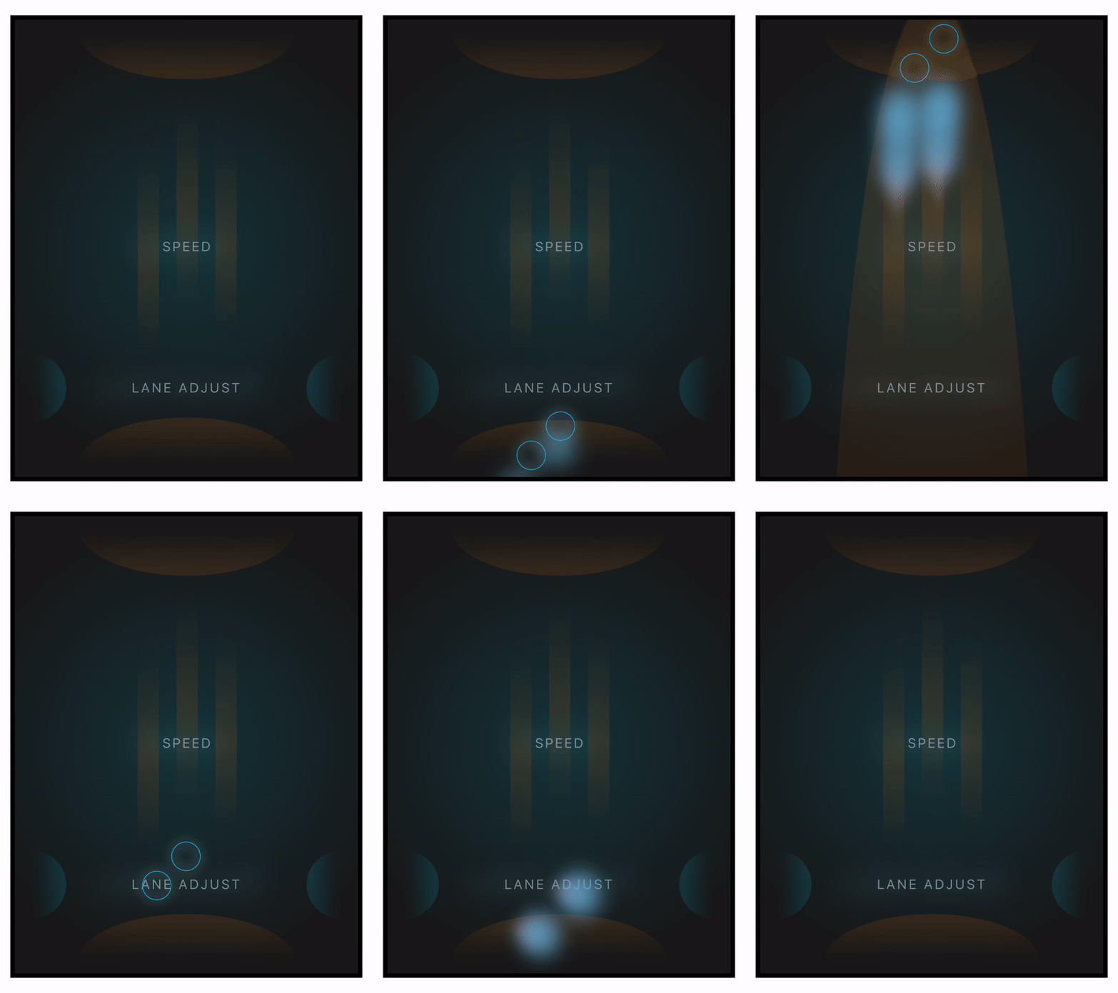
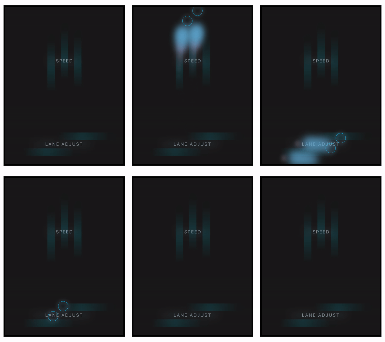

Secondary Screen Designs


User testing insights that helped inform this design:
- Users liked and understood how to use the control better when there were separate sections for speed and lane adjustment, as opposed to a central control that could move in four directions.
- People still didn’t see why they needed to move their arm so much for binary.
- The physical egg made users think a protrusion would actually be on the touch screen control, instead of just responding in that same manner digitally.
- Users still wanted more information about the context of speed and lane adjustment maneuvers, and labels on the control.
Design
From the previous iteration, we learned that we should stick with something resembling the Separated design instead of the Consolidated design because users understood it better. We also made sure to reduce arm movement required for binary decisions, add more labels to the control, and tweak the language on the monitor to provide stronger feedback and more information to the user about the outcome of their hand actions. We continued with one design that maintained the same structure as our Separated design which allowed users to adjust speed or lane position anywhere within the general area of the label (Center design), and experimented with another design that required pulling with broad strokes across specific activation zones, balancing intentionality with freedom from precise movement (Edge design). We again had the same binary design for each, but tried a new visual way of representing the swipe affordance - making the nebulous shapes touch.
Protocol Tech
For this set of designs, we began testing them digitally on a flat iPad in our simulation set-up. We also created animations that reflected the user’s touch, and showed confirmation on the control that the user had confirmed a binary decision.
Protocol Questions
Users were again asked the same types of questions from previous protocols, but were also specifically asked what they thought of the secondary screen, and also if this way of controlling the autonomous vehicle was better than taking over completely (manual driving). Also, half of the participants were shown the Edge design first, and half shown the Center design first, to eliminate any effects of knowing how to do one before exposure to the other. Finally, users were also shown an alternate set of secondary visuals at the very end of the test for their open input and comparison to the previous design.
Findings
Edge Design:
- Users unanimously did not understand the pulling strokes from the edges of the control
- 6/7 did not understand “lane adjust” as moving within a lane, as opposed to between lanes
- 4/7 tapped the bumpers instead of pulling on them
Center Design:
- Users unanimously preferred the Center design to the Edge design
- Users unanimously performed the intended interaction for speed, regardless of which design they were shown first
- Users unanimously understood swiping left/right to adjust in-lane (aside from confusion about the meaning of “lane adjust” on the control)
- 3/7 thought the bars indicated the number of fingers required for the interaction
- 3/7 appreciated fewer options on the screen
Binary Decision:
- 6/7 thought tapping the bottom shape would confirm the prompt
- 4/7 thought the open black space was an input area for tapping or tracing a path
- 3/7 wanted to confirm the prompt by completing an action incorporating the direction of the turn (like confirming a right turn on red by tracing a right turn path in the black area)
Secondary Monitor:
- Users split between whether or not the car icon was helpful in the alternate screen design
- Half of the users were confused about what the circular shapes for the in-lane adjustment screen meant (some thought they indicated movement, or speed, or space creation on that side)
Miscellaneous and Broader Insights:
- Consensus on our control being better than takeover
- Users want to tap any complete shape that might be a button
- Those who want a more minimal design understand the control and its use, while those that ask for more detailed information seem to need more clarification on the value of the control
- Understanding the translation of hand/arm movement to car movement is linked to how a user perceived the car in its environment
- If someone perceives the car as an object in space, they understand what is happening better and more easily
- If someone is looking at the control as a means of steering a mechanical object, it is more difficult for them to understand how to use the control
New Center Design | 7 Tesla Autopilot users, 7 Craigslist recruits with (regular) driving experience
Control Designs
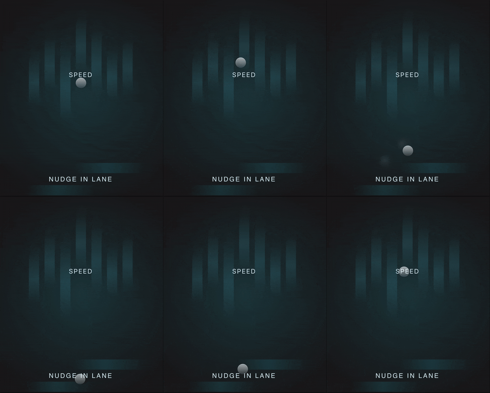

Secondary Screen Designs
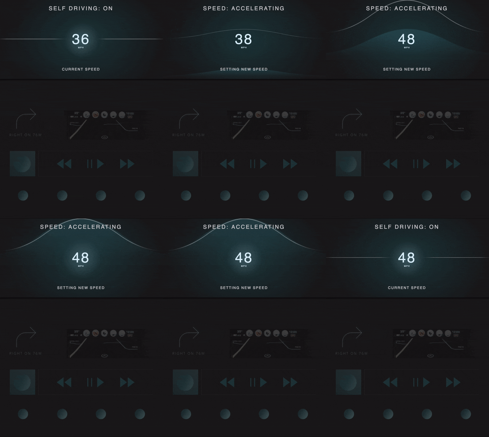

User testing insights that helped inform this design:
- The Center design was vastly more successful and understandable, allowing most users to perform the speed and lane adjustment maneuvers correctly without guidance.
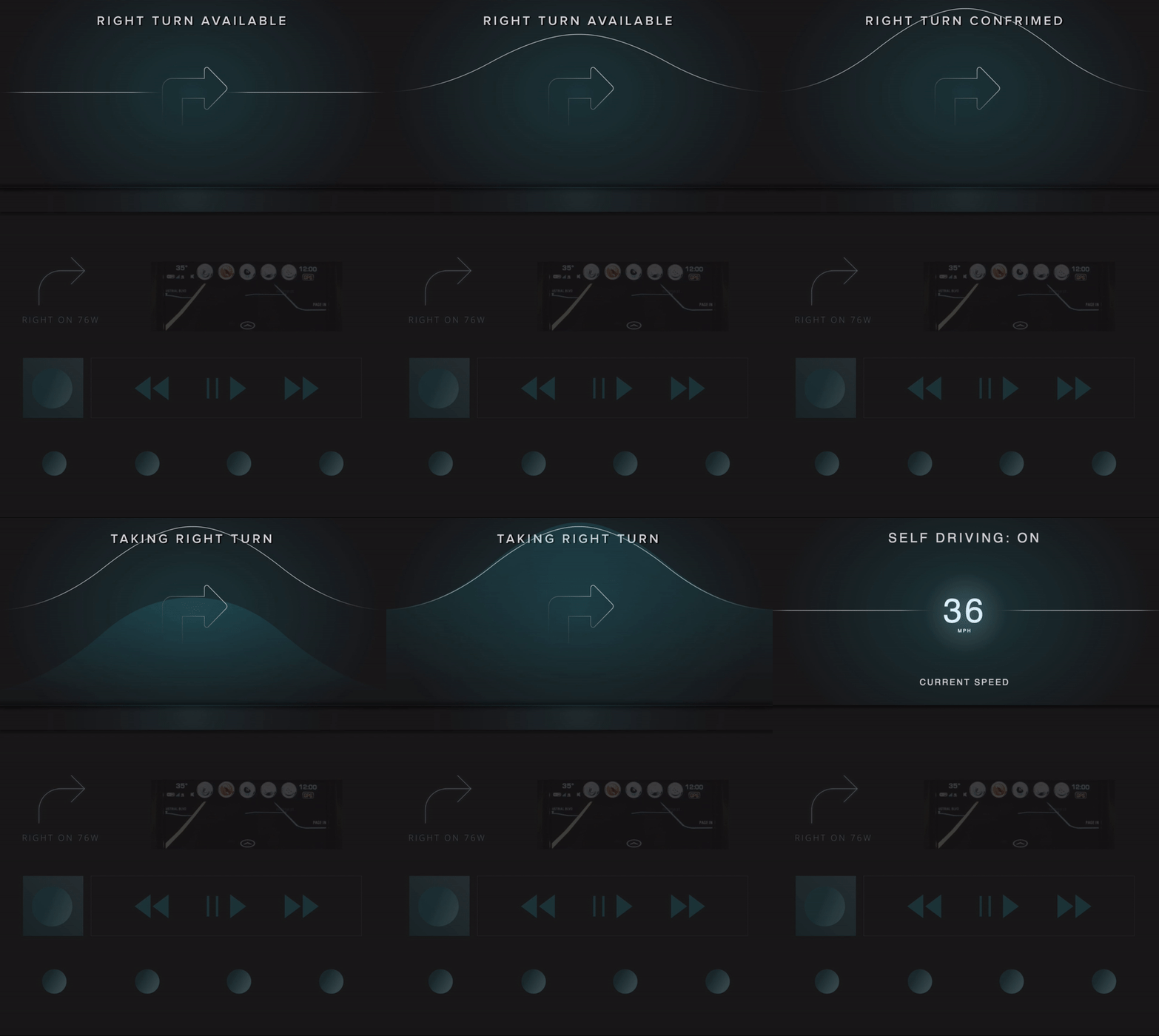
- The binary design needs to be adjusted so that it does not look like an open input area, and still encourages the swipe motion.
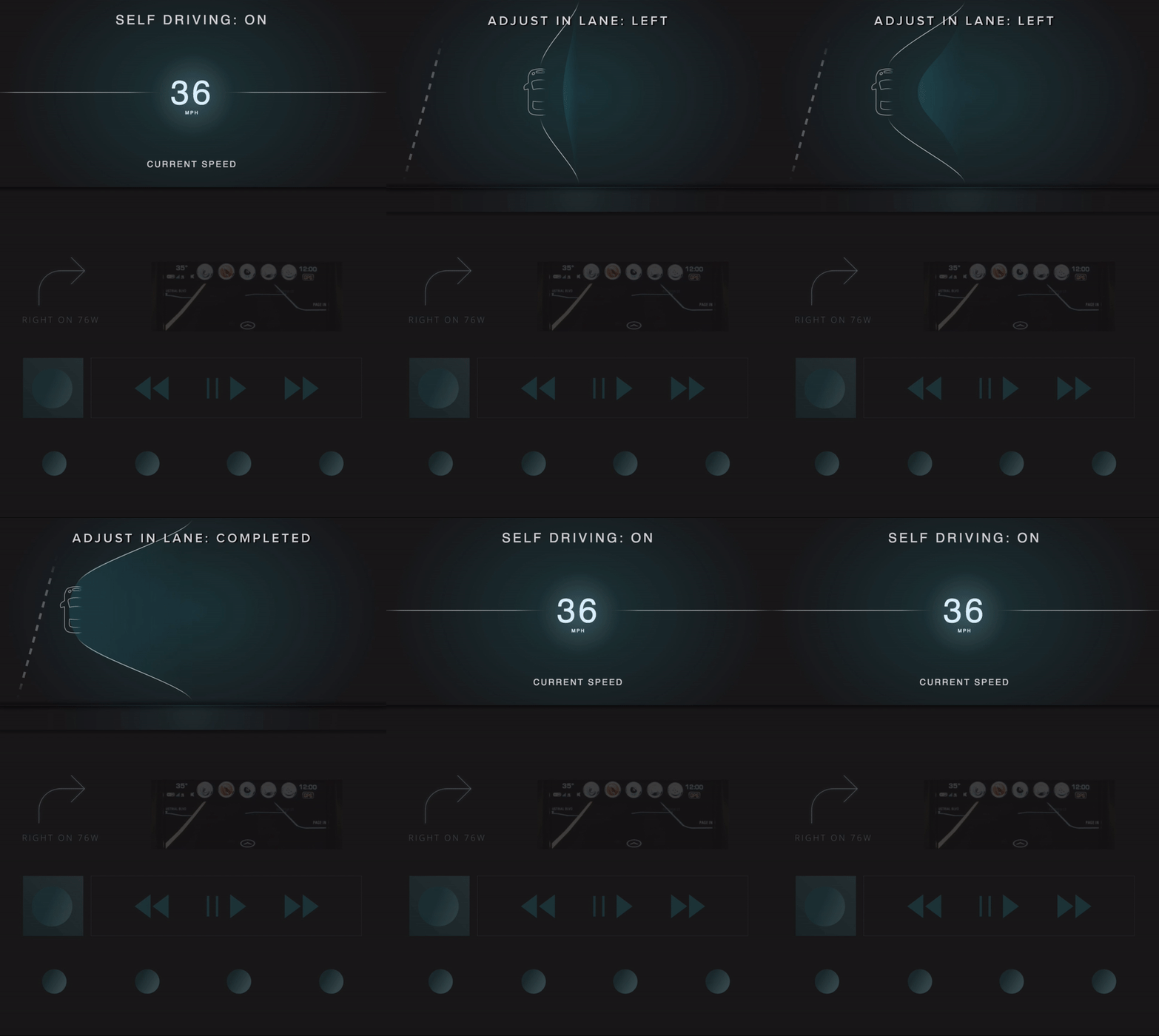
- In-lane adjustment visual for the secondary screen needs to be altered so it does not reflect space being created on the side one is moving towards.
- Any complete shape looks like a button.
Design
In the New Center design, the speed and lane adjust screens were kept the same as they were in the Center design previously as it was largely successful. The binary screen was changed to have a new kind of visual affordance and feedback reminiscent of blinds, eliminating the dark center area and labeling the two options on the control itself. A “wave and fill” metaphor was leveraged for the new speed display on the secondary screen, showing target speed being set and the progress toward that target speed. In-lane adjustment was also altered, placing a car icon on a string that resembled the wave from the speed screen, stretching to the left or right direction instead of trying to show arrows or shapes to the side of the vehicle (this was to minimize the impression that space was being created on that side of the car). Finally, the binary display on the secondary screen also used the “wave and fill” motif to reflect the visuals on the control for binary, and to show the progress of confirmation.
Protocol Tech
For this iteration, we put together a system for testing our digital designs on an interactive curved surface instead of a flat tablet. This involved a plexiglass curve on top of a projector with an attached infrared camera to track user hand movements through the plexiglass, triggering feedback on the screen and changes in the secondary screen and simulator (such as having the simulator increase in speed as the user swipes up on the control). See [Testing Environment] for more details on the testing apparatus and simulation set-up.
Protocol Questions
In the protocol, users were asked to complete the same tasks as recent iterations (affordances, speed, in-lane adjustment, a binary decision, their input on the secondary screen, and thoughts on our intended interaction patterns). However, in this test, the binary decision was changed from a right on red to passing a bus in order to learn more about user impressions of a different binary situation. Also, we added extra questions at the end to get some broader input about the concept, including questions about other use cases they would like addressed, and questions for Tesla drivers about when they’ve taken over from Tesla Autopilot before and how our control compares to the controls available to them in their vehicle now.
Findings
Speed
- All users except one performed the expected interaction for speed
- 10/14 users expected speed to begin changing as soon as they started moving their hand on the speed portion of the control
- About half of users understood the meaning and value of the “wave and fill” graphic on the speed display on the secondary screen
In-lane Adjustment:
- About half of users understood that the lane adjustment was about moving within a lane, not between lanes
- “Nudge in lane” was seen as appropriate but some but odd by many - it became clear that it should be changed to “Adjust in Lane” on the control and screen
- A few users tried to move side to side in the speed area of the control instead of the bottom area
- 6 Tesla drivers and 2 other users wanted more information about the real-life road conditions in the lane adjustment secondary screen (we suspect this has to do with the way Tesla expresses surroundings in their dashboard)
Binary:
- About half of users voiced and appreciated the benefits of the binary swipe instead of a button press
- Half of users tried to tap the word to confirm instead of swipe
- A few users swiped up on the control without guidance
- “Hang back” was soon as too casual or ambiguous by most - will change to “Dismiss”
Miscellaneous:
- 9/14 mentioned wanting an emergency stop function (3 Tesla drivers, 6 other users)
- A few users felt the secondary screen was too far to the right in their field of vision (location in instrument cluster or heads-up display would be better)
- A few users mentioned that having the same motion for speeding up and confirming binary actions was a good thing