Activities List
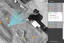
The activities list shows sequentially all of the observations added to a plan. The activities list is a centralized location for adding and removing waypoints, adding and removing observations to these waypoints, collecting the rationale for all observations, and manipulating instrument settings. Having the entire plan represented in one list allows for a clear understanding of which instruments are being used at each observation. This list is directly linked to the waypoints placed on the map and scientists can choose to edit the plan in either location. The connection allows the two plan representations to complement each other and provide easy access to contextual information as well as plan intent information.
Supporting Data
During the robotic reconaissance field test, we observed on several occasions that it was difficult for the science team to determine the order in which activities would occur. When multiple activities occurred at the same point, the person in charge of the plan would have to scroll over the point to see what all the activities were. On several occassions, we observed that the flight team was also confused over what order the waypoint would be occurring. The task lists provides a space to clearly list out the order of observations, and allows for easy reordering and removal.
Testing
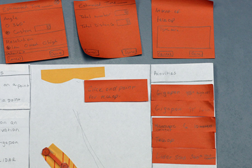
Initially, the activities list was simply a list of points and activities. The settings and notes panels would pop up next to a point once it was placed on the map. However, during user tests with paper prototypes we discovered that, because it was a pop-up, users seemed to think that this was where they were supposed to change the settings and did not realize that in some cases they could also be changed in the map (such as for the gigapan). The pop-up also took up a great deal of screen real-estate.
The settings and notes panels were eventually incorporated as drop-downs within the task list, saving screen real-estate and putting emphasis on the map interactions. However, during user tests with the digital prototype there were times when users did not seem to notice that there were settings other than those presented visually on the map. Subsequent versions of the prototype highlight the appropriate observation in the activities list when a point on the map is clicked, and vice versa, to better link the two different plan views.


