
Musings of 5 creatives focusing on the future of healthcare communications through the design of effective, personalized patient communication technologies.
See what we've builtIn this 8-month-long capstone project, we worked with MedRespond, an online healthcare communications company that combines artificial intelligence, search and streaming media to deliver interactive, personalized communication solutions to patients and clients.
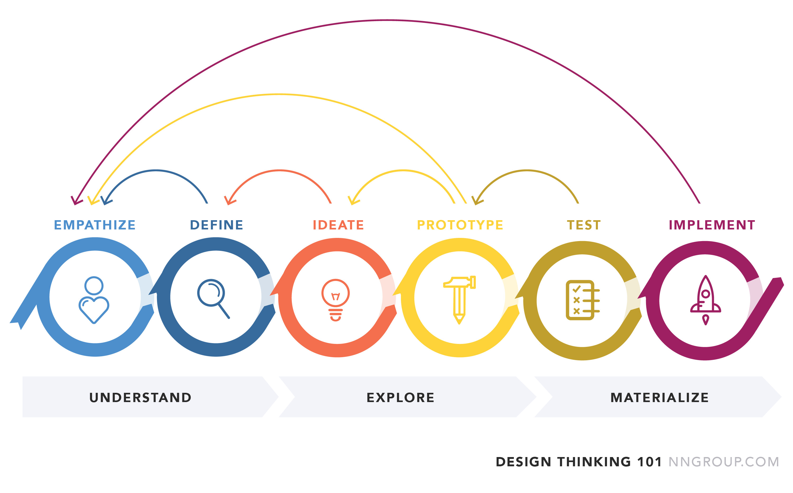
Inspired by the Nielsen Norman Group’s design thinking 101, we approached the project with an iterative design process, going from understand, explore, to materialize. To kick-off our project, we conducted both quantitative and qualitative research methods to achieve a deep understanding of the problem space. We then used various modeling techniques to conceptualize our research findings. We proceeded to ideate and design the solution, which was then iterated on based on the feedback collected through evaluative research methods. All of these stages highly overlapped as we used a research-through-design approach.


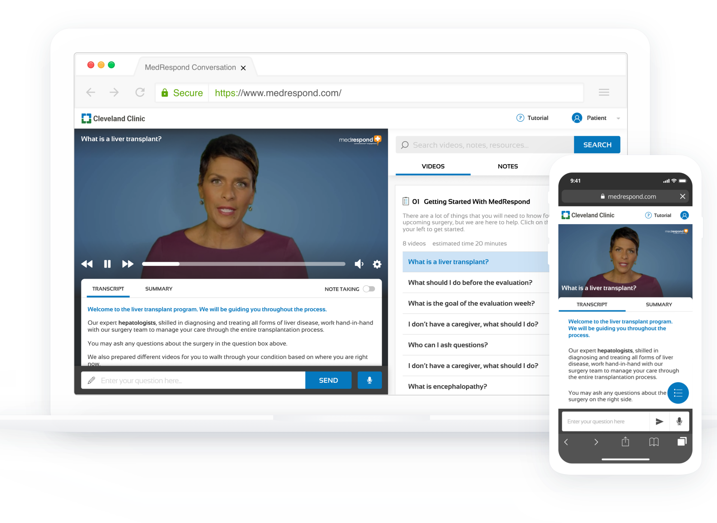
As conversation engagement is the cornerstone of the MedRespond value proposition, our primary focus was in demoing our overhaul of the following conversational features: question input, answer output, and error recovery. We also explored experimental conversational design with concepts such as immersive mode or voice-user interface.


We have made significant changes to the MedRespond navigation experience to increase the salience of key information and resources as well as help users more easily navigate the platform and track previous activities.
Our research has shown that MedRespond can be better positioned to ensure learning outcomes and relieve informational burden. As such we demoed the a set of features that help address key patient and caregiver unmet needs, including a dynamic transcript and note-taking abilities.


From the very beginning, MedRespond and Panacea have been concerned with creating a positively affective experience that makes the user feel loved. With a focus on the onboarding experience and users’ emotional needs, we have created a friendly, easily understood environment that demonstrates emotional sensitivity to the liver transplant patient and caregiver experiences.
Check out our final design highlights and design process!