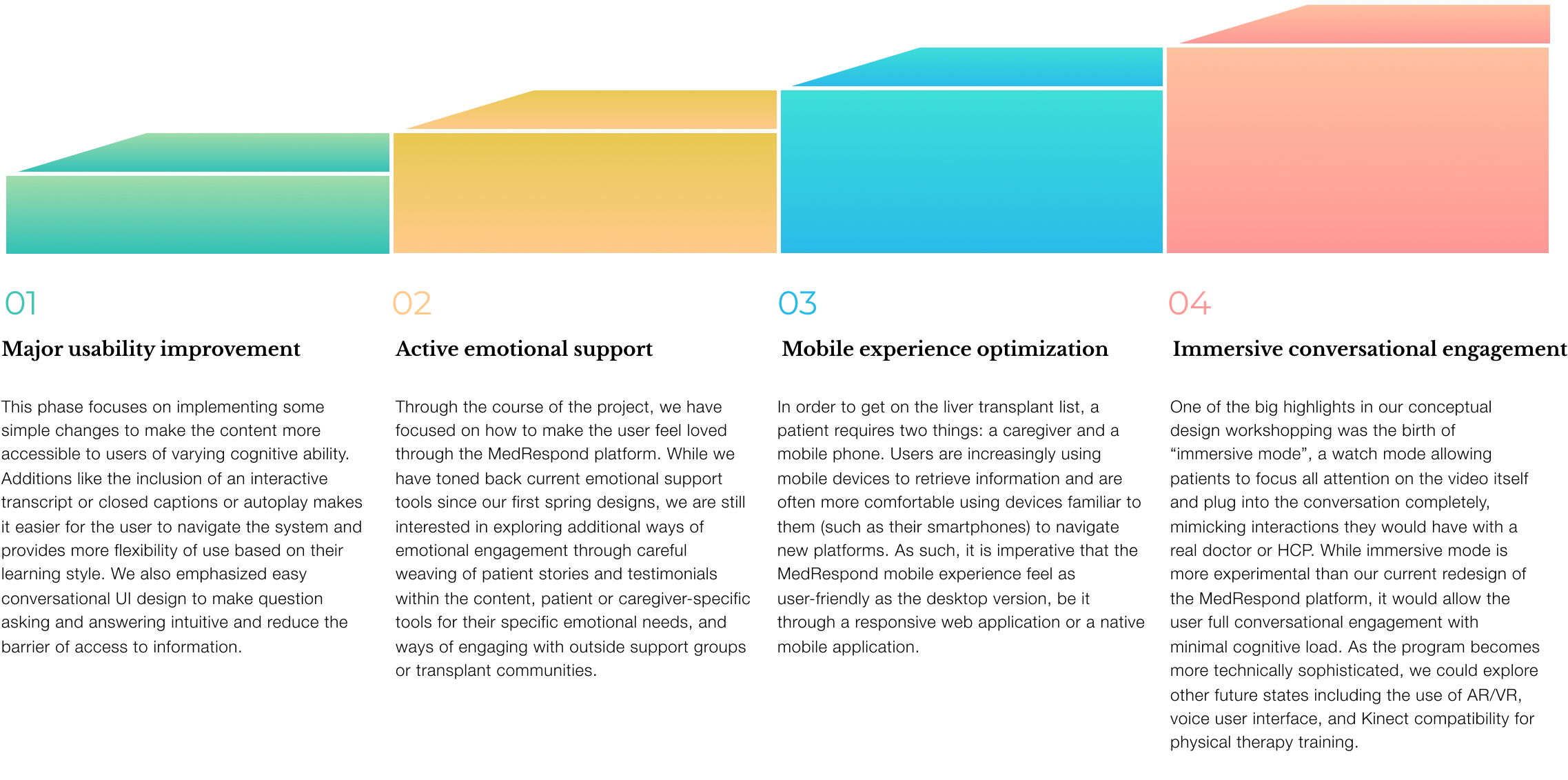
Leveraging the iterative user-centered design process to improve patient & caregiver experience.

Using the power of natural language processing (NLP), MedRespond’s product places an emphasis on natural conversational engagement to mimic real doctor-patient interactions. With the rise of conversational design, our goals were to enhance the conversational platform to be more engaging and intuitive, using both elements of conversational interface design as well as high-level visual and interaction design.
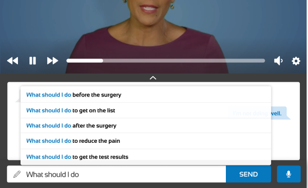
The key interaction of our conversational user interface (CUI) focuses on the ability to search for content by asking questions. In the question box, users are encouraged to type in questions similar to what they would ask a medical professional. From there, the natural language processing takes the query and runs it against the available videos in the platform database, matching the correct video to the user’s query and loading it for the user.
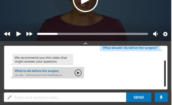
Some of the videos on the platform include an interactive component where the system asks the user a question. In these instances, users are encouraged to respond with either one of the suggested responses provided in the chat feature, or by typing in their own response. Based on the user’s input, the NLP follows up with the appropriate response to the user’s answer, simulating natural conversation.
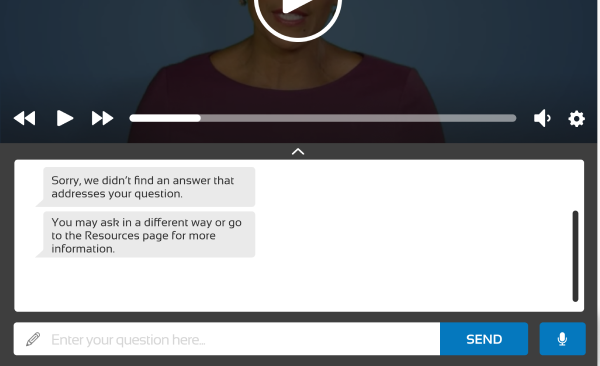
While there are hundreds of videos available to answer a variety of questions, sometimes there is a gap between what the user wishes to know and the content that is currently available to them. Two use cases where this can happen include:
1) A user types in a query that does not match any of the videos available in the database (ex: “What is your favorite ice cream flavor?”)
2) The NLP makes an error in translation and provides the user with a video that does not meet their needs.
Such types of errors highlight the need for smooth error recovery within the NLP, particularly in a platform that requires a great deal of trust from a user base that’s already under a great deal of stress. When a user requests content that doesn’t match any of the NLP, the chat interface responds with an apology akin to Siri’s “I’m sorry, I’m afraid I don’t have an answer to that.” The platform also suggests the closest related videos to that question to help guide the user closer to related information, even if it wasn’t the exact content they were looking for. Over time, this can help the user shape expectations and learn to frame questions in ways the computer can understand.
We designed a Table of Contents module where content is broken down into chapters. This way, users are better able to focus and digest the current chapter without being overwhelmed or distracted by content in other chapters. A brief chapter overview is also available for users to set expectations and mentally prepare for the upcoming videos. We provide estimated length of each video so that users may plan accordingly.
While interviewing patients and caregivers, the team realized that the “Resources” section bears a huge potential for users to access additional information that is not included in the video content. However, in the past iteration of MedRespond, Resources were difficult to locate and navigate. This design streamlines the resources discovery process.
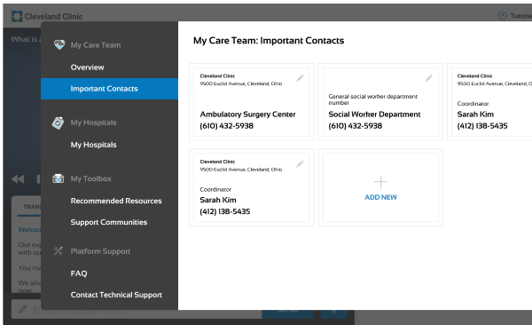
We designed information to be broken down in a way that better fits users’ mental models, so that users can better understand what “Resources” entails. In the main “Resources” page, we designed a clear information architecture so that users will be able to easily find useful information.
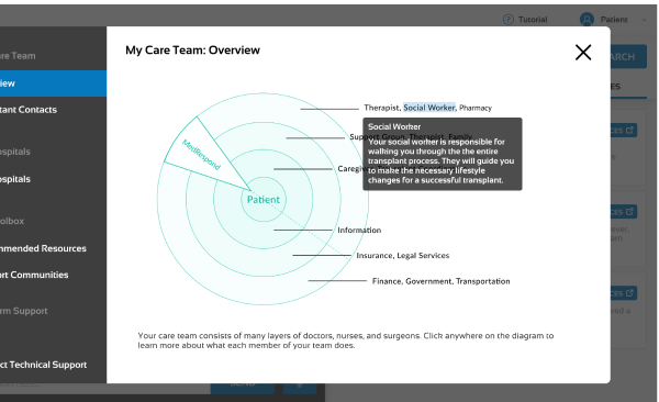
We included the Panacea Bullseye (from our artifacts section) as a way to show the patient which members of their care team are involved across every phase of the process, and how to easily contact them. Users can interact with the bullseye to find information relevant to their needs.
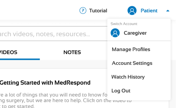
In order to provide flexible access for both user types, patients and caregivers will have separate accounts on the platform, as the journey is meant to be a joint experience. This way, the platform can serve both parties individually, as well as to encourage them to work as a team (as any good patient-caregiver relationship entails).
Transcripts are a crucial part of accessibility, as they provide users a way of ingesting content through a means other than audio. Transcripts allow users to rely on recognition over recall, easily navigating to the correct part of the transcript automatically instead of having to search for the desired content. Based on competitive analysis of online learning platforms and our heuristic evaluations, syncing transcript to the video provides greater flexibility, efficiency of use, and fulfills accessibility standards by allowing users to reinforce what they are watching through what they are reading.
From our research surrounding patient-doctor communication, we learned that when answering questions, patients often need to stop and ask about specific jargon or medical terminology. Note-taking behavior is prevalent among patients & caregivers. In Note-taking mode, the user can highlight portions of the transcript / summary and add notes. Our goal is to provide users a way to take notes easily and in one central location, as well as the ability to facilitate conversations with their HCPs and family if they wish to share their notes. Notes are for the user’s personal records; they are not reviewed by MedRespond.
Through evaluation of the current MedRespond platform, as well as industry standard recommendations, we have identified onboarding as a key first touchpoint to both making the user feel welcomed and comfortable using the platform. In order to provide a tailored experience where the specific emotional and informational needs of patients and caregivers can be both tracked and met by the platform, we now ask users to identify themselves at the beginning of onboarding. However, we also wish to facilitate patient-caregiver teamwork through our platform, as a unified front is critical through this journey.
