Prototyping Overview

45+

In the summer we created over 45 separate parallel prototypes, working in 1-week design sprints to design-evaluate-iterate.

Defining our MVP

Summer Design Plan

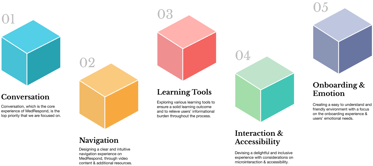
Drawing from spring research, at the beginning of the summer our team identified that a deep focus in the following key areas would add the most value, given associated costs.
Materializing our Concepts

Parallel Prototyping

As this is also a learning experience, and as one of our core team values is supporting each other’s personal and professional growth and learning from each other, we approached the summer with the goal of building experiences and skills rather than optimizing for efficiency.

Parallel Prototyping I
Explorations in Conversation and navigation
14 June - 20 June, 2019
Parallel Prototyping II
Exploring conversation, onboarding,
& emotional check-in
21 June - 27 June, 2019
Parallel Prototyping III
Onboarding, Note-taking,
Resources, History
28 June - 4 July, 2019
Parallel Prototyping IV
Mobile v1
5 July - 11 July, 2019
Parallel Prototyping V
Desktop Consolidation
12 July - 18 July, 2019
Parallel Prototyping VI
Mobile v2
17 July - 24 July, 2019

Testing our Solutions

Evaluative Research

09

Desirability
Study

Comparing our first spring redesigns with the original MedRespond design, we ask users to identify common feelings or thoughts they may have felt when navigating through the design.

10

Think
Alouds

We identified clear goals and tasks users would have when using our platform and tested for usability by asking participants to complete set tasks while “thinking aloud.”

11

System Usability Survey (SUS)

SUS is a 10 question survey that helps in classifying the ease of use of a platform. We asked participants to complete this survey after completing think-alouds of our new design.

12

Bipolar Emotional Testing (BERT)

Bert is a bipolar-facet evaluative method to measure user’s emotional response. We asked participants to complete the survey after completing think-alouds of our new design.
Insights from Spring Evaluative Research

Users want a clear and intuitive information architecture where they can easily access information.
Information in the current platform is organized in a non-intuitive way which caused confusion and surprises.
A more intuitive design of conversational interaction is needed.
Users don’t currently understand how the question box is to be used. Without a history of asked/answered questions, users often time have to ask the same question multiple times.
Users want a coherent learning flow and don’t want to be disrupted by autoplayed videos.
Lack of control over key platform functionality leads users to feel disrupted. Furthermore, lack of platform asking for permission before completing a new action further jars the user.
Users will benefit and feel empowered from added customization.
Users currently expect more from the platform then is given (i.e. expecting the number of their personal social worker to be in the video and expecting that the names of the people on their personal care team would also be part of the video).

Prototypes

Parallel Prototyping I

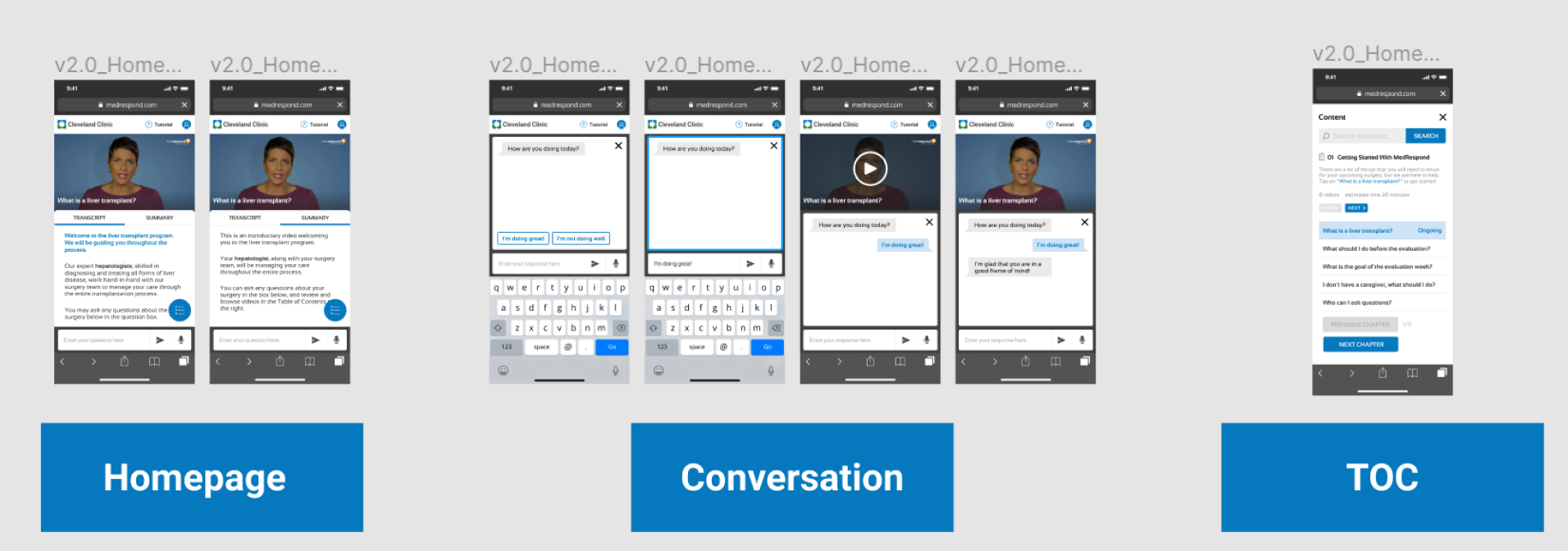
Design Sprint 1: Conversational User Interface design — this sprint focused on how users could ask and answer questions within the MedRespond platform, as well as where these conversations would live on the display.

Prototypes

Parallel Prototyping II

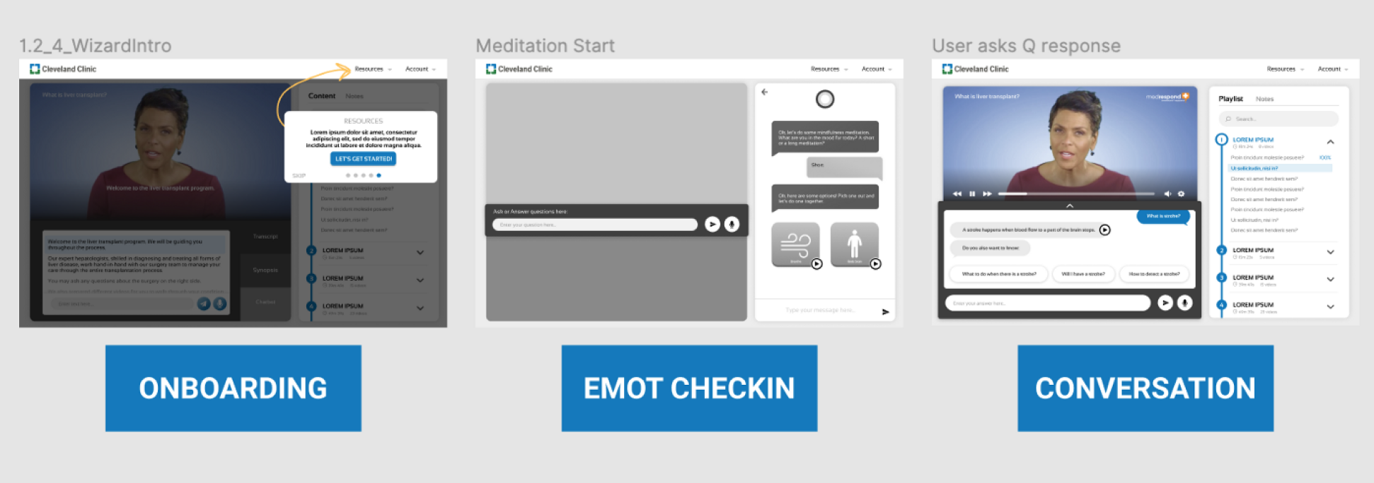
Design Sprint 2: On-boarding, emotional check-in, and conversational iteration — this sprint focused on creating an intuitive on-boarding experience, exploring opportunities related to affective design, and refining our CUI.

Prototypes

Parallel Prototyping III

Design Sprint 3: Note-taking, resources, and user watch history — this sprint focused on facilitating an easy note-taking experience (something patients & caregivers do frequently), creating an easy resources page with emotional and social resources, and allowing for easy review of what the user has watched already in their watch history.

Prototypes

Parallel Prototyping IV

Sprint 4: First iteration of mobile and further desktop iteration -- to get on the transplant waiting list patients need a caregiver and a phone. The majority of users we spoke with would access information on both desktop and mobile devices. This sprint focused on translating our desktop designs to mobile.

Prototypes

Parallel Prototyping V

Sprint 5: Desktop consolidation -- after weeks of iteration on various elements of MedRespond, we needed a sprint that focused solely on consolidating the design into one cohesive vision.

Prototypes

Parallel Prototyping VI

Sprint 6: Mobile V2 and further desktop iterations -- we further iterated on our desktop prototype as well as continued to finalize and iterate on features such as onboarding and conversation.