Accessible Visualization Tooling with Data Navigator
Impact: Offering developers a flexible foundation for building inclusive data experiences
Creating accessible online data experiences at scale remains difficult, and folks are left out when things are not built properly. For example, static chart images that lack semantic and structural information may be read by a screen reader as “image of a bar chart,” and charts built to require a mouse hover to display important information exclude those who are navigating in other ways.
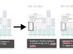
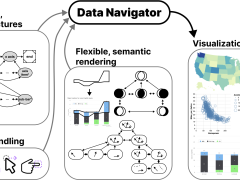
We developed the Data Navigator system to support developers, which in turn supports everyone interacting with the visuals they create. It aims to simplify the design and implementation of accessible visualizations -- including data navigation and diverse input methods (such as a screen reader, keyboard, speech or gesture detection) -- and is already impacting web technologies and standards in industry and journalism.
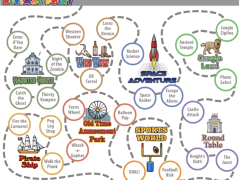
Our Data Navigator system uses a graph-based user interface structure, giving developers the support and flexibility needed to create accessible visualizations.
This work has now...
- Inspired innovations in web technologies and standards. Our research has inspired the Web Incubation Community Group, which has completed a proposal based on Data Navigator that would treat node-like structures as a first-class substrate, to enable assistive technologies, AI assistants, user agents, and foundation models to more efficiently leverage information on the web.
- Contributed to novel prototypes and the remediation of existing visualization ecosystems in industry and journalism settings. Our partners at Adobe and the New York Times have both built prototypes that leverage Data Navigator. Work is on-going to improve the accessibility of their data visualization systems using Data Navigator.
- Sparked an industry-led grant project to overhaul a widely-used data science visualization library, Bokeh. Bokeh, in collaboration with Quansight labs, secured funding specifically with the intention of leveraging both Chartability and Data Navigator to redesign and completely re-engineer the accessibility of their interactive data visualization library, which is used prominently (3.9 million monthly downloads) in the Python data science community.
Supported by: Apple
Timing: 2023-Present
Related work:
- “Data Navigator: An Accessibility-Centered Data Navigation Toolkit” [paper pdf]
- Data Navigator in Adobe’s React Spectrum Charts [GitHub link]
- Follow-up CZI-funded grant to apply our work to Bokeh’s interactive visualization ecosystem [link]
Researchers: Frank Elavsky, Lucas Nadolskis, Dominik Moritz
Looking at Additional HCII Impacts...
NoRILLA Interactive Mixed-Reality Science for Kids
Our novel, mixed-reality intelligent science stations bridge the physical and virtual worlds. Millions of children and families across the US are learning more science and improving their critical thinking skills after predicting, observing and explaining experiments with our patented system at their schools and museums.
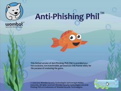
Protecting Millions of People from Phishing Scams
We studied the social aspects of phishing attacks and protected millions of people through education and training. This work led to new educational methods to raise awareness, effective anti-phishing warnings, and algorithmic detection of phishing attacks.
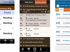
Tiramisu Supported Public Transit Riders and Research
Years before the public transit buses in Pittsburgh had GPS location trackers, we were exploring how riders could be the co-creators of mobile transit info. During this 10 year research project, this app made it easier for travelers with disabilities to engage in opportunistic travel and benefited 75,000 unique transit riders.
Developing Novel Interfaces for Livestreamed Gaming
Livestream gaming viewers are limited in the ways they can participate, but this team found that designing a better experience for livestreams has a variety of benefits for audiences worldwide.
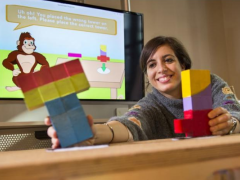
Creating Accessible Visualizations with Chartability
The Chartabilty framework has empowered people around the world to recognize the parts of a data visualization that produce barriers for people with disabilities. It has contributed to dozens of design languages, visualization guides, accessibility curriculum at universities, and the data journalism seen on news websites.
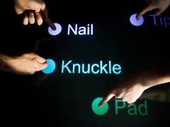
TapSense Improved Touch Detection on Millions of Smartphones
We trained smartphones to reliably detect four different touchscreen inputs – for example, a tap by a finger pad as compared to a knuckle – which created opportunities for new interactions and features.
Supporting Developers So They Can Build More Responsible AI
We conducted the first studies with industry practitioners to understand the challenges they face when building responsible AI systems. Our tools and methods are now supporting developers around the world.
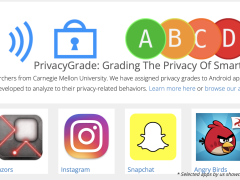
Grading Your Smartphone Apps on Their Privacy Practices
We created a model that analyzed over 1 million smartphone apps on their privacy and data collection practices, and then assigned them a public-facing privacy grade. This easy-to-follow grading system raised public awareness and led to improved privacy practices from several app developers.
Improved Math Mastery with the Decimal Point Game
We explored the learning analytics behind our digital learning game to see how student learning responds to curriculum changes to the game. Over the past 10 years, over 1,500 students have benefited from the Decimal Point game and curriculum materials.
Understanding the Impacts of AI in Child Welfare
We conducted the first field studies to understand how child welfare workers incorporate AI-based recommendations into their decision-making, which had far-reaching policy impacts.
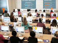
Designing Teacher-AI Collaboration Systems
Hundreds of elementary and middle school students across the US have learned more as a result of our work on real-time, teacher-AI collaboration systems in K-12 classrooms.
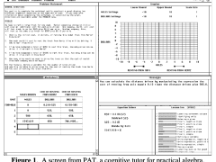
Millions Learned More Math with Our AI Tutor
Millions of middle school and high school students across the US have learned more math as a result of our decades of work with AI-based cognitive tutoring systems.
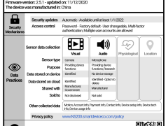
Human-Centered Privacy for the Internet of Things
As more gadgets become “smart” things and the Internet of Things (IoT) expands to tens of billions of connected devices, we want consumers to be aware of what their devices are doing with their personal data.
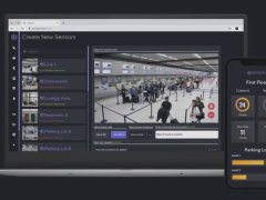
Zensors Turns Cameras Into Smart Sensors
In one application installed at the Pittsburgh International Airport in 2019, Zensors use existing cameras as powerful general-purpose sensors to provide wait time estimates for the security line, which benefits almost 10M PIT travelers per year.
Accessible Visualization Tooling with Data Navigator
A visual labeled as “an image of a bar chart” or that requires a mouse hover to display important info does not support all users. We created the Data Navigator system to give developers a flexible foundation for designing and building more inclusive data experiences.
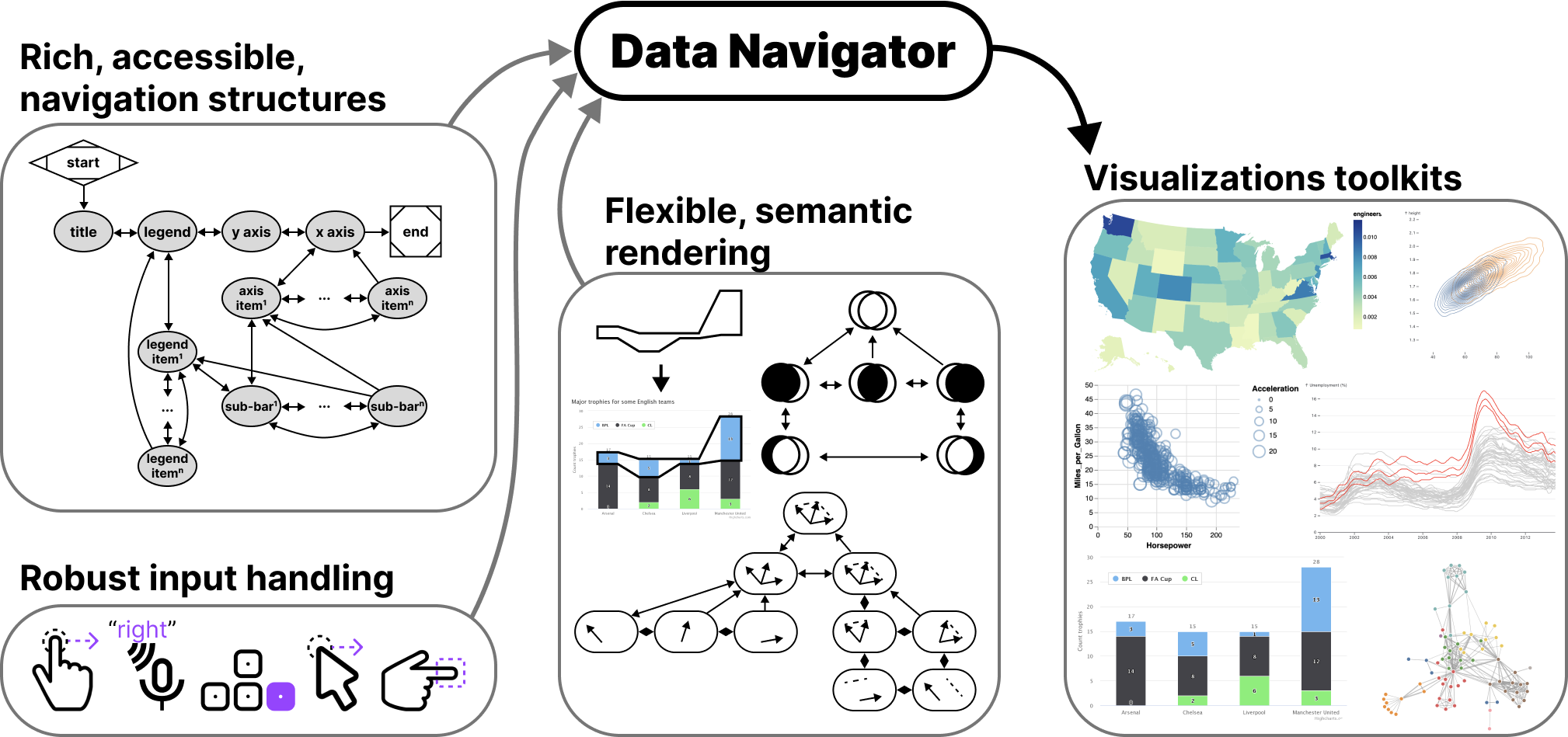
Accessible navigation structures, robust inputs, and flexible semantic handling are key elements of the Data Navigator toolkit.